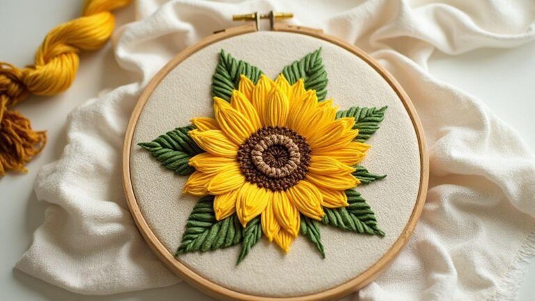
Understanding Light and Shadow in Embroidery Design
Core rules of light and shadow embroidery
You can control how your fabric speaks by the way you place light and shadow in your stitches. Think of light as a thread you lay down to create highlight, and shadow as the gentle dip that makes shapes feel real. When you plan your stitches, decide where the light will hit first, then build darker layers behind and beneath. This gives your piece depth that your eye can read from a distance and then study up close. Use a small, consistent twist on your thread to keep the sheen and texture even, so the light doesn’t scatter oddly across the surface. By treating light as a shaping tool, you turn a flat surface into a living image you can almost touch. Understanding Light and Shadow in Embroidery Design underpins every choice you make here.
Your choice of stitch and thread color should mirror how you read a real highlight. Start with light threads for the brightest spots, and progressively add darker threads as you move away from those points. This isn’t about matching a photograph perfectly; it’s about convincing the eye that there’s a light source and that your embroidery exists within it. If you’re stitching a curved shape, use longer satin stitches where light would kiss the surface and shorter stitches in recessed areas where shadow would settle. Consistency matters, so keep your tension steady and your stitch length similar in each section to avoid a jagged look that breaks the illusion. This approach ties back to Understanding Light and Shadow in Embroidery Design as you plan depth from the start.
Practice makes your light and shadow feel natural. Lay out a simple shape first—say, a leaf or a coin—and map how light travels across it. Then test different threads, browns, and grays, and compare the results side by side. You’ll notice that the eye fills in gaps when you set up a believable contrast. Don’t fear small mistakes; they teach you where light bends or where shadow pools. With time, your personal style will emerge—whether you prefer crisp, bold contrast or soft, feathered shading—and your embroidery will tell a more confident story. Understanding Light and Shadow in Embroidery Design helps you grow in confidence with each stitch.
How you read light on shapes
Light guides your eye around the form, so identify the brightest edge first and inspect where the light fades. You’ll want to place a few stitches right at the top of a curved surface to act as little beacons of glow. Then, step back and judge where the shadow should fall to keep the shape grounded on the fabric. The trick is to layer gradually: a light touch here, a deeper tone there, so the transition feels natural rather than staged. If you mix cool and warm tones, the shape can read as more dimensional because skin, fabric, and metal all reflect light a bit differently. Understanding Light and Shadow in Embroidery Design can guide these decisions and keep your forms cohesive.
When you’re reading light on a shape, think about the source. Is it overhead, from the side, or from below? Each direction changes what becomes highlight and what sinks into shadow. Use your thread counts to imitate that: longer, smoother stitches for bright planes and tighter, denser stitches for shaded areas. Don’t rely on one color to carry all the light’s story; a small shift in hue can emphasize the form and keep the piece lively. You’ll notice your shapes start to feel carved from the fabric rather than drawn on top. Understanding Light and Shadow in Embroidery Design reinforces the why behind each choice.
If a shadow feels flat, add a touch of reflected light on the edge opposite the main highlight. This tiny hint of light on the shadow side prevents the form from disappearing into the background. It’s a simple trick that rewards you with more realism without complicating your technique. As you practice, you’ll learn which shapes benefit from this extra sparkle and when to keep things clean and simple.
Use contrast in embroidery design
High contrast creates instant drama and makes your subject pop. You’ll use it when you want a focal point that catches the viewer’s eye right away. Start with a bold light or dark area and place surrounding stitches in the opposite value to push the center forward. This doesn’t mean every piece needs blockbuster contrast; balance is key. A little range between the lightest highlight and the darkest shadow can carry a lot of visual weight if you place it thoughtfully. Understanding Light and Shadow in Embroidery Design helps you judge where contrast reads strongest from a distance.
Remember to test color pairings before committing. A small sampler lets you compare how two threads interact under your lighting. Sometimes a color that looks right in a thread shop can read differently once stitched. If you want a gradual shift, blend two colors in a single stitch or work with a gradient of tones across a curve. That smooth transition keeps your design readable from a distance while rewarding close inspection.
Keep your edges clean when you push contrast. Soft transitions work for dreamy scenes; sharp edges work for graphic, modern pieces. Decide what mood you want and tailor your stitches to that effect. A single, crisp edge can anchor a design, while surrounding soft shading can cradle it and give warmth.
Key terms to remember
- Light source: Where the brightest area starts.
- Highlight: The brightest point on the shape.
- Shadow: The darker areas that create depth.
- Contrast: The difference between light and dark areas to create emphasis.
- Gradient: A smooth shift from light to dark.
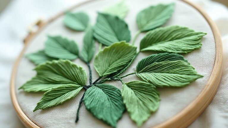
Shading stitches for depth and tone
You want your embroidery to pop, right? Shading stitches give your work real depth, turning flat outlines into soft, lifelike shapes. Start by planning your light source and where shadows will fall. Use a light color for the highlight and gradually layer darker tones where the form recedes. This approach creates a visual curve you can feel with your eyes, almost like a mini sculpture on fabric. Practice on scrap fabric first, then apply what you learn to your project so the shading reads clearly. Understanding Light and Shadow in Embroidery Design provides a frame for these steps.
Next, blend is your best friend. When you switch from one shade to another, use short, smooth transitions so your color shift isn’t abrupt. You can achieve this by overlapping stitches with just a touch of the new thread, then working back through the area with the light shade to soften the edge. It’s these tiny graduations that make your design feel round instead of flat. Remember to keep your stitches even; uneven tension can kill the depth you’re aiming for.
Finally, think about the fabric and stitch density. A tight weave needs lighter shading and more careful blending, while a looser cloth can take bolder contrasts. If your shading lands too harsh, pull back a shade or two and feather the edge again. Your goal is a natural transition that your eye reads as volume, not a line. With practice, you’ll see shading become an instinctive tool in your embroidery kit. Understanding Light and Shadow in Embroidery Design keeps this practice grounded.
Long and short stitch basics
Long and short stitches are the bread and butter of realistic shading. You start with longer stitches for the midtones and fill in the gaps with short stitches to build texture. Keep your threads snug but not tight, so you don’t warp the fabric. Think of it like painting with thread: lay down long, even strokes and then dab in the shorter ones to shape the form. Use a consistent direction for the main area, and switch to a lighter touch at the edges to avoid harsh borders. This technique is a practical embodiment of Understanding Light and Shadow in Embroidery Design.
Control comes from your stitch length and spacing. If your long stitches are too long, the color pools oddly and looks muddy. If they’re too short, you lose the smooth gradient. Practice pacing: small adjustments over a larger area make for the most natural shading. You can also mix fibers or add a split stitch to mimic hair or felted textures. Remember, the goal is quiet transitions, not loud patches of color.
When you blend two colors, place the lighter shade as the base and let the darker shade overlap at the edges. That overlap creates a soft seam that your eye reads as depth. If you’re layering on a curved surface, tilt your stitches slightly along the shape. It gives your shading a directional flow, like light bending over a hill. Understanding Light and Shadow in Embroidery Design informs these micro-motions that read as volume.
Satin and split stitch tips for blends
Satin stitches give you smooth, glossy surfaces, perfect for soft blends. Keep your stitches uniform in length and angle so the surface remains even. If you want a subtle gradation, use a fine thread or thinner needles to avoid a chunky look. You’ll notice the light catching the satin surface differently as you vary the stitch width. That variation reads as gentle volume, which is exactly what you want for realistic shading. Understanding Light and Shadow in Embroidery Design helps you predict how light will play on satin.
Split stitches create texture without losing the blend. They let you stitch a line of color with a slight break that breaks up flat areas. To use them in blends, lay down the base color with satin stitches and then slip in the darker shade by splitting the thread’s edge. The result is a soft, textured transition that still looks smooth from a distance. It’s a neat trick when you’re working on fabric that DIY projects don’t always forgive. This is a practical application of the principles in Understanding Light and Shadow in Embroidery Design.
For a really natural look, mix satin and split stitches in the same area. Keep the split-stitch edges barely visible, almost like you’re drawing with light and shadow. Practice with a small motif first, then apply the technique to bigger shapes. You’ll find blends that once felt stiff can now breathe with a quiet, tactile glow. Understanding Light and Shadow in Embroidery Design anchors these experiments.
Best stitch for soft blends
The best stitch for soft blends is the satin stitch for coverage and the split stitch for texture. Satin gives you a clean surface that handles color transitions gracefully, while split stitches add a gentle jagged edge that mimics real hair, skin, or fabric veining. Use them together to create depth without harsh lines. Layer your colors in light, medium, then dark, always in the direction of the form. This keeps your shading coherent and believable.
Keep your threading light and your tension even. If your stitch sits too high or too flat, you’ll lose the soft blend. Practice on a swatch the size of your project’s smallest feature, then scale up. You’ll notice the difference when a single well-placed blend makes a face smile or a leaf glow. Your goal is a timeless, natural look, not a painted-on effect. Understanding Light and Shadow in Embroidery Design helps you recognize when to push for softness versus crispness.
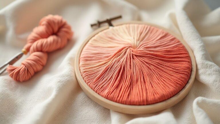
Blend thread colors for realistic embroidery highlights
You unlock realism when you blend thread colors for highlights, not by using one bright strand. Start with a base light color and add subtle shifts of white or pale hues to mimic how light lurks on fabric. You’ll get a more natural glow if you mix threads on the needle or base palette, creating a soft transition rather than a harsh line. Think of this like painting with thread: you want the light to drift, not shout. Understanding Light and Shadow in Embroidery Design underpins why these blends work.
Practice is your best tool here. Try a small sample swatch and test three blends: a pure highlight, a light blend, and a mid-tone. You’ll quickly see how the transitions read on the fabric. Use a few short passes with a smooth, even stitch to keep the surface level and shiny areas bright, then ease into the next line. The result feels alive, not flat, and your embroidery starts to pop with depth.
When you plan a project, map the light source and pick your blends accordingly. You aren’t choosing colors just to fill space; you’re shaping where the eye rests. If you want people to notice the gleam on a leaf or the sparkle in a bead, your blend choices should guide that focus. Remember, the right blend makes the highlights breathe. This echoes the principles of Understanding Light and Shadow in Embroidery Design.
Choose colors for midtones and highlights
Midtones are your bridge between shadow and light, so pick colors that live in the same family but read differently as you layer. A warm midtone can soften a cool highlight, while a cooler midtone can push a warm highlight forward. You’ll get the most natural look if you pick hues with the same undertone, then adjust brightness with lighter threads for highlights and deeper shades for shadows. Understanding Light and Shadow in Embroidery Design helps you choose harmonies that read as intentional light rather than random sparkles.
Test a few combos on scrap fabric. Start with your base color, then add a lighter midtone to lift the area gradually. For highlights, go two steps lighter or mix with a touch of white. If the midtone starts to feel flat, shift one step in either direction to wake it up. The secret is tiny, controlled shifts—one shade lighter here, one shade warmer there. Understanding Light and Shadow in Embroidery Design supports this careful tuning.
As you work, keep your palette organized. Label threads by undertone and brightness so you don’t mix them up mid-stitch. When you maintain a consistent color family, your highlights read as intentional light rather than random sparkle. This approach makes your embroidery look cohesive, not hurried. Understanding Light and Shadow in Embroidery Design helps you maintain that cohesion across your project.
Use shadow blending stitches to soften edges
Shadow blending stitches are your tool for soft, gradual edges. Instead of a hard line between light and dark, you blend a few threads from the shadow side into the highlight area with tiny, overlapping stitches. This creates a natural fade that the eye reads as depth. You’ll notice the shape softens and the fabric breathes with the design. Understanding Light and Shadow in Embroidery Design gives you the mindset for when to blend and when to leave crisper lines.
Keep your stitch length short and go slow. Each pass adds a little more shadow, so you control how soft or strong the edge becomes. If you over-blend, the edge can blur; if you under-blend, it looks blocky. The trick is to practice steady, even pressure and maintain a consistent stroke direction. Your motifs gain dimension without looking painted on.
Shadow blending works best around curved edges or where light wraps around a form. For example, the curve of a petal or a rounded leaf benefits from these transitions. When you master this, you’ll feel how light and shadow sculpt your embroidery with quiet confidence. Understanding Light and Shadow in Embroidery Design helps you know when to apply this technique for maximum effect.
Highlight placement in embroidery
Place highlights where light would naturally hit the object, not where you think they should be. Visualize a light source—top-left is common—and map highlights along the raised planes. A precise placement makes the design read clearly and feel realistic. Understanding Light and Shadow in Embroidery Design reinforces why certain spots glow more than others.
Use small, deliberate stitches for highlights at corners, tips, and the tops of raised surfaces. A little extra brightness on these spots often sells the dimension more than a broad sweep of light. If you’re unsure, test on a scrap: mark the brightest points first, then fill in with your midtones and the blend later. You’ll see the composition come alive as the highlights land exactly where they should. This practice aligns with the ideas in Understanding Light and Shadow in Embroidery Design.
Use thread direction lighting to show form
You’ll notice that how you light your stitches can make the stitching feel alive. When you angle light along the thread’s direction, the form of your work pops with subtle shadows and highlights. This isn’t magic—it’s technique. You want the light to skim the surface, catching the raised edges and letting recessed areas recede. Try placing a small lamp at a 45-degree angle and slightly above your embroidery. You’ll see how the threads catch the glow and reveal the depth you’ve built, not just the color you chose. Practice with a simple satin stitch first, then observe how the light changes as you rotate the fabric in your hands. The goal is to let the light hug every contour so your subject looks dimensional, not flat. Understanding Light and Shadow in Embroidery Design helps you map how light travels across texture.
When you test lighting, you’ll understand that every stitch reads differently under the same lamp. You can experiment by moving the needlework closer or farther from the light and by shifting the angle. You’ll find that Understanding Light and Shadow in Embroidery Design helps you judge where a line should curve or where a highlight should fall. If a seam reads too harsh, soften it with a tiny change in thread tension or by blending with a slightly lighter shade. The right lighting makes you see where your next stitch belongs, not where it already sits. Keep your eyes off the color for a moment and study the form the light reveals—that’s where your embroidery gains its personality. This is the essence of Understanding Light and Shadow in Embroidery Design in practice.
As you grow more confident, you’ll use lighting like a painter uses a brush. You’ll let the direction tell you where to place reflective stitches, where you need a matte finish, and where a high shine belongs. This approach helps you plan your next step, not guess at the result. With practice, you’ll light your piece in ways that mimic real scenes—daylight for gentle curves, or a lamp’s warm glow to emphasize cozy texture. Your work will feel more real because the light does the talking, guiding your hands toward the right path. Understanding Light and Shadow in Embroidery Design remains a reliable companion on this journey.
Align stitches with your form curves
Alignment is the heartbeat of dimensional embroidery. When your stitches follow the curve of the form, you create natural motion that our eyes read as life. Start with a simple curve and lay the stitches so every thread lies along that flow. If you’re stitching a leaf or a petal, let each line sweep with the curve rather than across it. This keeps highlights and shadows moving with the shape, not fighting it. You’ll see that the form gains clarity and your texture becomes a believable surface, not a stitched map.
Keep your tension steady as you curve stitches in. Too tight, and the line becomes stiff; too loose, and it wobbles. Aim for a smooth arc where each stitch nestles next to its neighbor, forming a continuous line. As you work, turn the fabric in your hands and check from different angles. You’ll notice tiny misalignments that steal the sense of form. Fix them now—re-balance stitches, adjust length, or slightly redraw the line with a fine pencil mark. Your goal is harmony between curve and thread so the design breathes and reads as one sculpture, not a collection of separate stitches. This aligns with the broader principles in Understanding Light and Shadow in Embroidery Design.
When you practice, choose motifs with natural curves—waves, vines, or limbs—and then test the effect of aligning every stitch with those curves. You’ll quickly spot where misalignment disrupts the form and learn to correct it by changing stitch type or direction. This isn’t about perfection; it’s about making the form feel consistent to the eye. With time, aligning stitches with your form curves becomes second nature, and your embroidery gains graceful, life-like movement.
Turn angle for shine and texture
Turning the stitch angle slightly changes how light hits the thread, giving you sparkle in the right places. A small turn can reveal a new facet of shine on satin or create a delicate texture on a split stitch. Think of your thread as a tiny conductor; a tiny angle tweak sends light along its path and makes a surface shimmer where you want attention. Start with a modest adjustment, then watch how the glow shifts as you rotate the fabric. You’ll notice where the texture should pop and where it should stay quiet. Understanding Light and Shadow in Embroidery Design helps you decide when a small turn will improve readability.
As you dial in the angle, you’ll find that different fabrics demand different turns. A smooth silk gives a sleek glide of shine when angled just so, while a rougher weave benefits from a slightly bolder turn to pick up texture. Keep a notebook of what angles work for each stitch on each fabric. Then you can reproduce the effect later, cutting your setup time and boosting consistency. The right turn angle brings your design to life, giving you the balance of glow and matte that makes your work finished. Understanding Light and Shadow in Embroidery Design reinforces this practice.
When you apply turning angles thoughtfully, you’ll control the drama of your piece. A sharp angle creates a crisp highlight on a high point; a softer angle yields a gentle glow along a curve. Use this to guide the viewer’s eye along your design, following the journey you intend. The result is a piece that looks intentional, with light and texture working in concert to tell your story. This is the art of Understanding Light and Shadow in Embroidery Design in action.
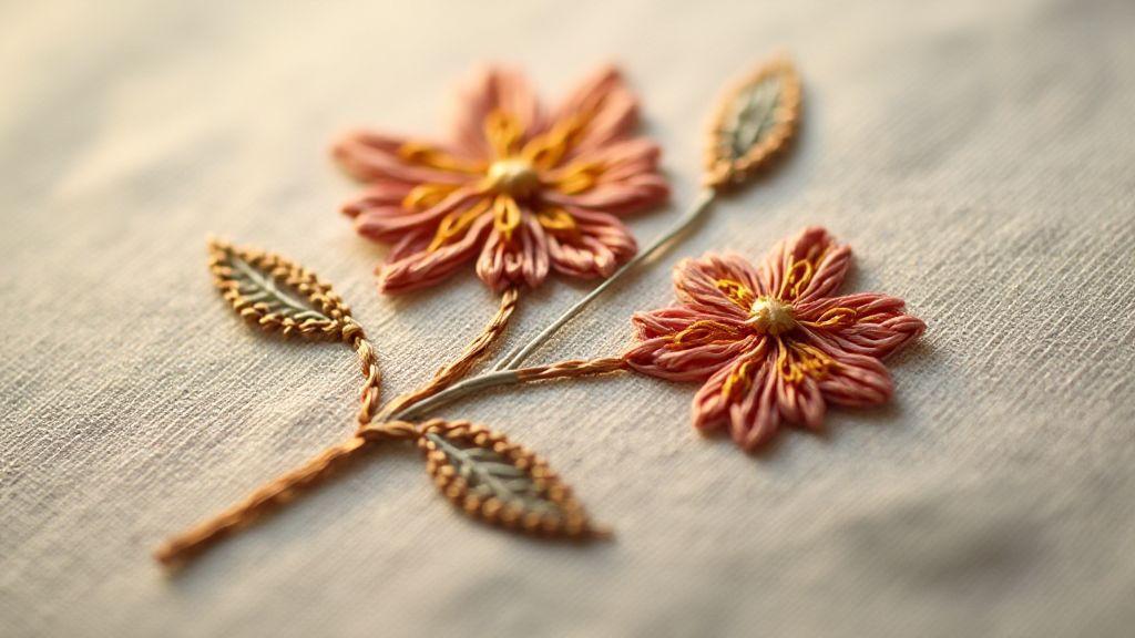
Build 3D effect embroidery shading with layers
Embroidery gains life when you think in layers. Your first layer sets the base, the second adds form, and the top shows the final highlight. By organizing your stitches into stacked planes, you guide the eye to the areas you want to pop. You’ll notice that even simple shapes look dynamic when you separate light from shadow with careful color and stitch choices. Use a light color for the base, a mid-tone for the mid-layer, and a darker shade for the top layer to craft a believable depth. Understanding Light and Shadow in Embroidery Design helps you plan these layers with intention.
Each layer should have a clear purpose. The base lays the flat area, the mid-layer adds curvature, and the top layer defines crisp edges and fine details. You don’t need to cover the entire area with each layer—focus on the contours where light would naturally fall or recede. This disciplined approach keeps your embroidery looking dimensional without becoming muddy or crowded. Think of layers like architectural floors: the foundation, the mid-rise, and the crown, all visible and contributing to the overall shape.
Keep your stitch length consistent within each layer, and balance density to avoid stiffness. If you feel a piece getting overpacked, pause and re-evaluate which areas truly need depth. A small, precise stitch can do wonders for a corner or a bevel, while a longer satin stitch might smooth a broad contour. The goal is a gentle progression from light to dark that your eye reads as rounded forms, not flat patches. This planning aligns with the chiaroscuro principles discussed in Understanding Light and Shadow in Embroidery Design.
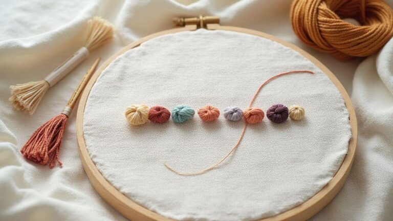
Add padding and underlay for height
Padding gives your design immediate lift before the decorative stitches start. You’ll create a subtle foam of fabric beneath the stitches, which keeps the surface from sinking and helps the colors sit cleanly. Use a light touch so the padding doesn’t puff up beyond the intended shape. The underlay acts like sketch lines: it establishes the route your stitches will follow and helps grip the fabric. Start with an even, low-density fill that follows the outer edges of your design, then add a second underlay that matches the inner curves. This layered groundwork makes your final shading more precise and less prone to wobble. Understanding Light and Shadow in Embroidery Design provides context for why underlay supports top stitches.
When you add padding, you’re essentially building a tiny pillow for your embroidery. This is especially helpful for areas that would otherwise look flat on thin fabric. Underlay lines should run in the direction that supports your top stitches, guiding them to float just above the fabric rather than sinking. If you’re unsure, test on a scrap: you’ll see how each layer changes the surface height and how light interacts with it. Padding plus underlay is the quiet engine behind that stunning, almost sculpture-like rise. This concept is a practical embodiment of Understanding Light and Shadow in Embroidery Design.
Paint cast shadows with dark tones
Dark tones anchor your light areas and push the eye toward the highlights. Use a color that’s several shades deeper than your base to simulate cast shadows. Apply these shadows along the inner curves, beneath raised edges, and where fibers would naturally overlap. Keep the placement deliberate—shadows should follow the form, not random patches. You’ll notice the embroidery gains gravity, and the texture reads as more tactile. Understanding Light and Shadow in Embroidery Design helps you place shadows with intent.
To blend shadows convincingly, vary your stitching technique. A short, tight satin stitch can create crisp shadows along a lip, while a long, slightly looser fill can soften the transition where the light meets the dark. Don’t overwork any one spot; you want a smooth gradient from light to dark. Remember, a good shadow isn’t just darker; it’s strategically placed where light cannot reach as fully. Understanding Light and Shadow in Embroidery Design remains your compass for these decisions.
Layering order for depth
Order your layers from lightest to darkest, and let each layer slightly overhang the previous. This overhang lets the top edge catch the light and read as a defined contour. Start with the base color for the widest shape, then add subtle mid-tones that define volume, and finish with the darkest shade along the edge where you want the deepest shadow. Keep edges clean between layers so each color sits neatly on top of the last. Understanding Light and Shadow in Embroidery Design reinforces this layering strategy.
Maintain consistent pressure and stitch direction across layers to prevent lumps. If a layer begins to feel glued to the fabric, reduce stitch length and density a touch, then recheck the height. A well-ordered stack makes the whole piece look unified, not stitched in separate blocks. Your goal is a seamless gradient where light and shade mingle naturally across the design. The concept of layering is central to Understanding Light and Shadow in Embroidery Design.
Plan chiaroscuro embroidery and final contrast
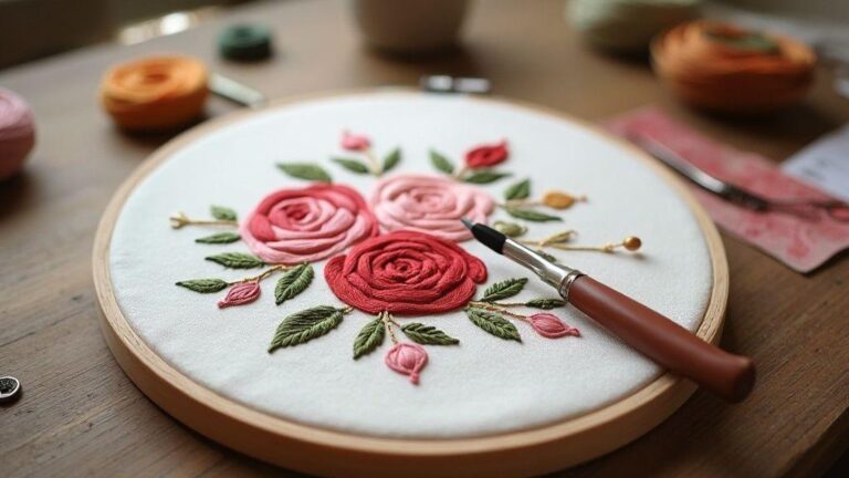
Chiaroscuro is about making your embroidery look three-dimensional by playing with light and dark. You’ll want to plan where the brightest and darkest spots will fall before you thread a single stitch. Start by picturing your subject as a simple silhouette and then decide which areas will catch the most light and which will sink into shadow. This planning saves you time and helps you keep your stitches consistent across the whole piece. As you map out your design, think about how a real light source would hit curves and edges, and translate that into satin stitches, long-and-short fills, and subtle blends. Your end goal is a piece that reads clearly from a distance and rewards closer inspection with fine tonal shifts. Understanding Light and Shadow in Embroidery Design provides the framework for these choices.
Next, sketch a light-or-dark roadmap on your fabric or trace it onto water-soluble stabilizer. You’ll place your brightest highlights where you want your eye to land first, then layer medium tones, and finally deepen shadows in the areas that should recede. Leave room for your stitching texture—the same value can look different depending on thread sheen and stitch density. By planning the contrast, you ensure your chiaroscuro feels deliberate, not accidental, and you have a clear path for color choices and thread types. The result is embroidery that pops with depth. Understanding Light and Shadow in Embroidery Design anchors this process.
Finally, think about how you’ll balance the whole piece. Even with strong light and dark areas, your eye needs a resting spot. Use a midtone around faces or central figures to keep them grounded. Consider background elements that may steal attention if too dark or too bright. A cohesive contrast plan helps every stitch serve the design, not just look pretty up close. With careful planning, your final piece shows a confident play of light and shadow that feels both realistic and artistic. This is the essence of Understanding Light and Shadow in Embroidery Design in practice.
Map your light source before stitching
Before you thread, decide where the light comes from. You should know whether the sun, a lamp, or a candle is the boss of your scene. When you pin down that source, you can map out where the highlights land and where the shadows grow. This step keeps your stitches honest and makes your shading feel intentional rather than guesswork. You’ll find it easier to pick stitch types and lengths that match where light would naturally hit. Understanding Light and Shadow in Embroidery Design makes mapping your light source a practical habit.
Now, translate that map into your stitches. If the light hits a cheek, you’ll use lighter threads and shorter, smoother stitches there. Where the brow and nose bend away from the light, you’ll switch to slightly darker threads and denser fills. The goal is a smooth gradient that your eye reads as real light, not a sudden jump from bright to dark. Don’t forget to consider the thread’s sheen—glossy threads pick up light differently than matte ones, so your highlights might pop more with a tiny size increase or a long-and-short blend. Understanding Light and Shadow in Embroidery Design helps you foresee these effects.
Finally, test your plan on a scrap swatch. Do you see the light race across the fabric as you move it? If not, tweak the stitch density or thread choice. A quick test saves you from redoing a big section later. Your map becomes your guide, and your embroidery gains a natural glow that customers notice instantly. This planning mindset aligns with Understanding Light and Shadow in Embroidery Design.
Boost focus with contrast in embroidery design
Contrast is your secret weapon. You want the eye to jump to the focal point, then drift to the supporting details without confusion. Start by pinpointing the main subject and ensuring it has the strongest lights and darkest shadows. Use brighter threads or a satin stitch to create crisp highlights, and pair them with deeper, slower shadows to anchor the piece. Understanding Light and Shadow in Embroidery Design helps you balance focus with harmony.
Then layer in midtones to smooth the transitions. A well-placed midtone acts like a bridge between light and dark, preventing harsh jumps that can make the embroidery feel flat. If you’re stitching petals, for instance, let the light fall on the outer edges and shade toward the center, using a gentle long-and-short technique that keeps the curve believable. Remember: you’re sculpting with thread, so your contrast should feel natural and not cartoonish. The framework of Understanding Light and Shadow in Embroidery Design supports these artistic choices.
Keep a balance that respects the overall image. Too much high contrast can shout, while too little can vanish into the background. A good rule is to check your work from a few steps away. If the focal area still reads clearly, you’ve nailed the contrast. If not, dial back or push a shade a touch lighter or darker until your design breathes. This practical judgment comes from applying Understanding Light and Shadow in Embroidery Design to real motifs.
Checklist for final touch-ups
- Review light sources: Does every highlight and shadow align with your mapped light source?
- Inspect stitch density: Are the transitions smooth, or do they jump oddly?
- Check thread sheen: Are gloss highlights reading correctly, or do they look muddy?
- Balance contrast: Is the focal point clearly stronger than the rest without overpowering it?
- Secure edges: Are all threads anchored well to prevent fraying at the frame or surface?
- Test view: Look at the piece from arm’s length and up close to confirm depth reads well.
- Label your plan: Keep a quick note of which areas use which stitches and tones for future projects.

I’m Sophie Caldwell, the author behind granaboom.com, and I believe hand embroidery is one of the simplest, most relaxing ways to create something beautiful with your own hands. I started this blog to help beginners learn hand embroidery without feeling overwhelmed by complicated instructions or “perfect” results.
Here you’ll find beginner-friendly guides to decorative embroidery stitches, along with clear step-by-step practice ideas and patterns you can use to build confidence. My focus is on making the learning process easy: simple explanations, helpful stitch combinations, and small projects that look polished even when you’re just starting out.
Welcome to granaboom.com—grab your hoop, choose a few colors, and let’s stitch one line at a time.