How to Create Realistic Skin Tones in Portrait Embroidery
Color theory for your skin tones
You’ll love how color theory can elevate your embroidery when skin tones read real and lifelike. Start by noticing how light changes skin color in different lights. Pinks, peaches, and browns shift when you move from shade to sun. Your goal is to map these shifts to threads and stitches so your work reads as natural. When you choose colors, think in terms of depth, brightness, and warmth, not just one flat shade. This gives your pieces instant realism and keeps viewers from guessing what you were trying to show. This approach is a key part of How to Create Realistic Skin Tones in Portrait Embroidery.
Your palette should include a mix of neutrals and subtle hues. Layer light peach over a warm brown to create a glow, or blend a cool undertone with a warm highlight to simulate shine. Remember, your skin tone isn’t a single color; it’s a choir of tones that sing together. By choosing threads that echo this mix, you’ll bring drama and life to your portraits. The right balance helps your stitches sit like real skin on fabric, not a flat sticker of color.
As you work, test your color choices against a photo or your reference fabric. Step back to see if the stitched skin reads correctly from a distance, then up close. Your goal is harmony between the threads and the cotton, so the eye sees warmth without too much glare. If something feels off, tweak one shade at a time instead of redoing the whole area. Small, thoughtful adjustments keep your piece cohesive and convincing.
Learn warm vs cool undertones for your work
Warm undertones give a sunny feeling, like afternoon light on your subject. You’ll often mix corals, peach, and warm browns to achieve this glow. Cool undertones read more like shadowed, twilight skin, with blues and mauves tucked in sparingly. Know when to lean into each and how they interact. If your base color seems flat, a touch of warmth or coolness can wake it up and make the face pop.
When deciding, think about your reference. If the person has a sunlit look, add warmth under cheeks and along the nose bridge. For cooler undertones, you’ll want a light violet or blue-gray shadow in the hollows of cheeks and eyes. The key is balance: don’t push the cool or warm too far, or the skin will look muddy or bruised. Subtlety is your superpower, and it comes from testing on scrap fabric or a practice piece.
As you practice, keep a small chart of undertone tricks. For warm undertones, note which pinks and corals blend best with your base skin color. For cool undertones, track which blues and mauves help soften harsh shadows. With time, you’ll instinctively reach for the right shade and know it will read as natural skin in your embroidery.
Use complementary colors to mute your tones
Complementary colors sit opposite on the color wheel and can calm or enrich your skin tones when used right. If a shade feels too bright, a tiny amount of its opposite can mute it into a more natural look. For example, a touch of greenish-blue under-shadow can soften a too-warm pork-pink cheek. You’re not repainting the skin—you’re dialing in depth so the face reads as real.
Think of your threads like spices for a dish. A pinch of the right opposite color, blended smoothly, can bring out warmth without turning the skin odd. Always test on scrap fabric first. A slight amount goes a long way, and you’ll learn what your particular thread brand needs to harmonize with your base tones.
When you’re unsure, start with the most flexible complementary pair for your work: a small dash of cool blue or green under the cheekbone, then adjust until you see a natural glow rather than a color clash. It’s all about quiet correction so your skin tone stays believable.
Apply simple color theory steps
Begin with a base skin tone, add a subtle highlight where light would hit, then deepen shadows in the eye sockets and under the chin. Layer in a touch of the complementary color only where the photo shows cooler or muted areas. Continuously compare your piece to the reference, keeping color transitions soft and gradual. Your goal is a natural gradient that reads as three-dimensional skin rather than flat color.
Choosing embroidery floss for your skin color
You want your portrait to feel alive, not flat. Start by thinking about your skin color as the base you’ll build on. Here you’ll learn how to pick floss that matches undertones and blends naturally with highlights and shadows. Your goal is to create depth without glaring contrasts, focusing on nuances in tone, not just one flat shade. When you choose floss, test small threads near your face in light that mimics daily wear, and compare them side by side. The right floss should disappear into the skin’s texture while still letting features breathe with subtle color variation.
Your skin isn’t one flat color, and your embroidery shouldn’t be either. You’ll want a range of hues: a base that matches your general tone, lighter tones for highlights, and deeper shades for shadows. Use floss with slight variance in tone rather than stark jumps. If your portrait is porcelain, pick cooler pinks and neutrals; if you’re warmer, lean toward peachy and golden hues. Always keep a small scrap of fabric swatch to test against your skin in natural light. You’ll be surprised how a tiny thread can shift the whole feel of your face when it sits against the right cotton or silk.
When you’re choosing, consider the mood you want. A soft, velvety look comes from gentle gradations, while a more dramatic portrait uses bolder, but still harmonious, shifts. The goal is to blend, not compete with, your skin. If a color feels too pink, dull it with a touch of warm beige. If it looks too brown, brighten it with a whisper of peach. Your best tool is patience: compare, test, compare again, and let your eye guide you. This process supports How to Create Realistic Skin Tones in Portrait Embroidery.
Compare cotton and silk floss for your portrait
- Cotton floss is sturdy, easy to work with, and forgiving for beginners. It holds shape well and comes in bright, consistent colors. For your portrait, cotton lets you build smooth transitions by layering lightly and letting the natural texture of the fabric show through. It’s a practical workhorse that won’t overwhelm delicate details. If you’re stitching on linen or a rougher fabric, cotton’s bite can help you control threads without snagging.
- Silk floss glides effortlessly and has a natural luster that mimics real skin’s glow. It blends softly between tones and creates a more lifelike surface because of its sheen. Silk is better for fine shading and seamless gradations from light to shadow. But it’s pricier and can be more slippery to work with, so you’ll want steady hands and a light touch. If you’re aiming for a portrait that reads as photographic, silk’s depth and glow can make a big difference.
Your choice isn’t either/or. Many embroiderers mix both: use cotton for stable coverage in broad areas and silk for the subtle transitions around features. This combo gives you durability where you need it and a soft, natural look where you want depth. When you test, stitch small swatches with both fibers side by side to compare how they sit on your fabric under your lighting.
Use DMC and Anchor codes to pick threads
DMC and Anchor codes are your map for skin tones. Start by collecting a small palette of warm and cool neutrals labeled with their color numbers. You’ll want a light base shade, a mid-tone, and a couple of shadow tones. For most portraits, a light neutral around a 1xx or 2xx range works well as a base, with mid-tones in the 3xx or 4xx range, and shadows in the 5xx or 6xx range. It’s not about chasing exact matches, but about keeping the overall harmony of your skin’s warmth and depth.
When you pick threads, note the undertones. If your skin leans pink, include cool pinks or rose tones. If it leans golden, gather warm beige and honey tones. You’ll also want a few muted, desaturated shades so you can soften edges rather than hard-line them. The codes help you stay organized when you’re mixing brands, making it easier to repeat the look on other parts of the portrait without guessing.
To test, thread a small sample and place it near your face in natural light. Compare not only the hue but the feel of the color—does it sit on the surface or melt into the fabric? Use the codes to note your favorite combinations so you can recreate them later with precision and speed. This process helps you build confidence in How to Create Realistic Skin Tones in Portrait Embroidery.
Match your floss under natural light
Natural light is your truth-teller. When you’re matching floss for skin tones, take your swatches outdoors or by a window where sunlight hits directly. The sun reveals the true warmth or coolness of the color, plus any subtle shifts you might miss in indoor light. Hold several threads near your cheek and tilt your head to see how they blend with your natural shadows and highlights. You’re looking for threads that disappear into your skin tonality while still allowing your features to pop.
If a shade looks good under lamp light but too yellow or pink outside, mark it as a daylight variant and adjust. You’ll likely combine a base shade with small amounts of cooler or warmer threads to get the glow you want. Remember, the goal is to keep the texture of your skin intact—floss should enhance, not shout. Keep tests simple: one base, one highlight, one shadow, and a couple of tweak threads you can layer on. This practice supports How to Create Realistic Skin Tones in Portrait Embroidery.
Mix threads for your skin tone palette
You want a skin tone palette that looks real, not flat. Start by choosing three to four base thread colors that sit near your subject’s undertone. Think warm pinks for sunlit cheeks, peachy browns for midtones, and a touch of taupe for shadows. Then add a couple of cooler tones—grays or blue-tinged browns—to help you cool down areas that look too warm. Mix these in small amounts on a palette, not straight from the spool. Your goal is a seamless blend that builds depth without abrupt shifts. Practice mixing on a scrap fabric first, so you learn how much of each color you need.
When you layer, the magic happens. You don’t want one flat color; you want a living skin tone that changes with light. Your mix should feel like a conversation between colors—one layer hints at the next. Use a light hand at first and gradually darken where you want shadows. This approach gives you a believable, skin-like glow instead of a chalky finish. It’s all about balance: enough variety to read as skin, but not so many colors that you look painted.
Keep your toolkit simple but smart. Label your blends so you can re-create them later, and store them in small containers with clear lids. You’ll be surprised how often you return to the same blends for different projects. The right mix makes your portrait embroidery feel alive, almost as if your thread took a breath.
Layer two to three shades for realism
Layer one sets the base, but realism comes from layering two to three shades over it. Start with a midtone that matches your subject’s current skin color. Then add a lighter highlight sparingly on the cheeks, bridge of the nose, and forehead to simulate light catching the skin. Finally, pull in a deeper shade to carve out shadows under the cheekbones, jawline, and sides of the nose. The key is weaving—don’t just place color, blend it into the base so transitions feel natural.
As you layer, you’ll see your portrait gain depth. A small amount of a cooler gray can push the edges back without making things look muddy. If a highlight seems too bright, soften it with a touch of your midtone. You’re aiming for a soft, fleshy feel rather than a flat finish. Remember to step back every so often and view your work from a few feet away; what reads as a highlight up close should softly merge from a distance.
Consistency is your best friend here. Keep your pressure even and let each layer dry before adding the next. If you overbuild in one area, use a clean brush or stitch to nudge it back toward the surrounding tone. You’re shaping a living face, not coloring a drawing, so patience pays off with realism that stands up to close inspection. This practice supports How to Create Realistic Skin Tones in Portrait Embroidery.
Add neutral grays to control saturation
Grays are your secret weapon to prevent colors from shouting. Introduce neutral grays to cool or mute tones that feel oversaturated. A touch of gray in the midtones can push the color back from the edge of cartoonish and toward true skin. You don’t want gray to dominate; you want it to guide the eye so transitions stay smooth. Think of gray as a traffic controller for color.
Use gray cautiously, especially around areas like the lips or cheeks where warmth is natural. A small amount can unify a patchwork of tones, reduce muddy overlaps, and maintain a cohesive look. If you notice colors fighting each other—two tones that don’t blend well—try a whisper of gray between them to calm the clash. Your goal is harmony, not a grayscale disguise.
Keep your gray blends labeled and accessible. You’ll reach for them often when you’re polishing edges or adjusting saturation after the main layers have settled. With grays in your toolkit, you can dial in realism without losing brightness or life in the skin. This supports the ongoing effort of How to Create Realistic Skin Tones in Portrait Embroidery.
Blending stitches to smooth skin
You’ll feel the difference when you start blending stitches to smooth skin. Think of your fabric as a canvas of shadows and light, and your needle as a brush that blends them together. Start with small, patchwork-like strokes across the cheek or forehead, letting colors meet softly in the middle. The goal isn’t crowding color or making hard lines; you want a seamless transition from light to dark. Practice by layering tiny stitches, then pull them snug enough to stay in place but loose enough to wiggle into new shades if needed. Your finished area should look like a real skin tone melting into another, not a sticker on fabric.
As you blend, keep your thread directions varied. A few perpendicular stitches here, a gentle curve there, and you’ll avoid a stiff, tiled look. Use a mix of nearby colors—one shade lighter, one shade darker—and let their edges bleed into each other. If you notice a harsh edge, add a few extra tiny stitches to soften it. Rely on your eyes more than the pattern; if something looks off, tweak the blend with a light touch rather than a full redo. Your goal is a natural, cohesive skin surface that people can believe is real.
When you’re happy with the blend, step back and test in good light. If a line or seam still looks obvious, add another thin layer of stitches over it. The little adjustments add up. Remember, blending is about shading and depth, not perfect color matching. If you can see every color change, you’re doing it wrong. You want a gentle, almost photographic finish that supports the portrait, not competes with it.
Use long-and-short stitches to blend your colors
Long-and-short stitches are your secret weapon for smooth transitions. Start with a longer, light stitch that glides across the surface, then tuck a shorter, slightly darker one beside it to create depth. Keep the stitches staggered so the color shifts aren’t abrupt. You’ll be surprised how a few well-placed long stitches can kiss the edge of a shadow and fade into a highlight. This technique creates a soft, natural skin texture that reads as real fabric, not painted fabric.
Work in small sections and rotate your fabric as you go. If you fall into a rut, switch the direction of your stitches to break the pattern. When you join colors, a gentle overlap helps blend the boundary. Don’t overfill one area with heavy stitching—the light should breathe. If you’re unsure, pause and compare to real skin under light; you’ll see where the tones need to drift. With practice, your long-and-short strokes will become invisible, and your portrait will glow with life.
Use split and satin stitches for fine texture
Split stitches give you a delicate edge that mimics soft pores and fine texture. Start with a thread that isn’t too glossy, split the stitch as you pass through to create a thread-thin line. This is perfect for the lightest freckles or subtle skin texture, where you want detail without shouting. Satin stitches add a smooth, even surface that catches light just right. Use them for small patches of color—lips, the tip of the nose, or a curved cheekbone edge. Keep your satin stitches snug but not pin-straight; a tiny bow in the middle can add a natural irregularity.
Alternate between split and satin stitches to build realistic texture. A few tiny satin stitches next to a couple of split stitches can give you pores, pores that don’t look painted. If you’re blending, let the satin areas catch highlights while split stitches hold the softer shadows. This mix adds depth and a believable skin pattern, especially when you pair it with the long-and-short foundation beneath.
Soften your edges with tiny stitches
Tiny stitches are your best friend for soft edges. Place a string of micro-stitches along the margin where two tones meet, just a thread or two wide. They act like a feathering brush, smoothing the boundary without leaving a hard line. If you see a ridge, add more of these small stitches until the edge dissolves into the neighboring color. The result is a gentler contour that reads as real skin rather than printed color. Keep your stitches light and consistent in density so the edge stays airy and natural. Your eyes will thank you for the subtle, almost invisible transition. This technique is where portrait embroidery truly earns its realism.
Shading techniques for your embroidery portraits
Practicing shading turns flat stitches into life. You’ll balance light and shadow with easy steps that fit your style. Start by choosing a range of threads that blend smoothly from light to dark. You want colors that sit next to each other on the color wheel and have a similar value, so your transitions feel natural. As you stitch, imagine you’re painting with thread, not just filling space. The result should be a face that looks soft, not cartoonish.
To begin, lay down a base layer that matches the lightest skin tone you plan to show. Then build up depth by layering progressively darker threads. Don’t rush: small, gentle changes read as realism better than big leaps. If you find a color jumps too far, mix it with a touch of its neighbor to soften the edge. This is where you start to see how shading shapes the subject’s cheeks, nose, and jawline. Your portrait will start to breathe.
Experiment with thread texture too. Matte cottons mimic skin more closely, while a light sheen can create highlights that pop. Keep your palette tidy so you don’t confuse your values. By the end, your portrait should feel dimensional, not flat, as if light is curling around the features.
Place highlights where light hits your subject
When light lands on the face, place bright threads where the light would naturally settle. Think of the high points: the tops of cheekbones, the bridge of the nose, the brow ridge, and the cupid’s bow. Use a light color that blends well with your base skin tone. A small amount of white or pale peach can work, but don’t overdo it. You want a glow, not a glare.
Build up highlights gradually with short, clean stitches. If your highlight seems too stark, soften the edge with a tiny touch of the surrounding midtone. This keeps the shine from looking pasted on. Consider the light source: if the light comes from the left, place slightly more highlight on the left side of features to keep everything believable. Your aim is a natural radiance that makes the portrait feel alive.
Deepen shadows with cool darker threads
Shadows give your portrait depth and contrast. Choose cooler dark threads to avoid muddy blacks that flatten the face. Think navy, plum, or cool brown rather than warm espresso tones. Cool shadows recede naturally, which helps the features pop forward. Start with the deepest shadows in the eye sockets, under the cheekbones, and along the neck edge. Use longer, flowing stitches to mimic soft shading rather than abrupt lines.
Layer shadows in thin passes. Each pass should blend into the next, never sit on top as a harsh stripe. If you notice a shadow looking heavy, lift the color slightly with a small amount of its lighter neighbor. You’ll keep the face three-dimensional without losing skin tone harmony. The goal is subtle drama, not theater makeup.
Control depth with stitch direction
The direction you stitch tells your brain where to place depth. For rounded areas like cheeks and the sides of the nose, use curved, follow-the-contour lines. This helps the fabric read as cylindrical rather than flat. For the planes of the face, switch direction to map out flat surfaces—forehead, jawline, and chin. Small, tight stitches keep edges crisp where you want definition, while looser, longer stitches emulate soft transitions in areas like the forehead.
Change directions gradually as you move across a feature. A single halo of color won’t sell depth; it’s the way you bend and shift your stitches that makes the shape read as real. Practice tracing a portrait’s outline with a flow that mirrors your subject’s contours. Your embroidery will gain dimension with every careful turn of the needle.
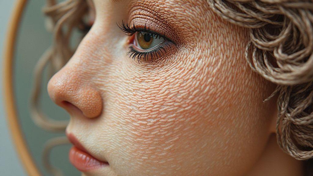
Create lifelike skin in your embroidery
Your goal is to capture warmth, depth, and subtle color shifts in every stitch. Start by building a color ladder that includes multiple skin tones from light to deep, then blend them softly rather than shocking with one bold shade. Practice with small samples, layering under gentle light to see how each thread interacts with fabric. When you stitch, use fine, short stitches that mimic the texture of real skin, and vary the direction to imitate natural contours. By paying attention to value changes and blushes, you’ll move from flat to lifelike in a way that feels natural to the eye.
Think of skin as a dance of tones, not a single color. Use peach, rose, and warm brown notes together, then introduce cool undertones under shadows. Avoid harsh borders; feather transitions with gradual blends where light meets shade. If a seam line interrupts the skin, offset it with a tiny cap of lighter threads or add a dab of highlight at the edge. Your finished piece should invite the viewer to lean in and notice the tiny shifts that say, this is real.
Practice on a small portrait motif before tackling a full project. Keep notes on what worked—thread brands, stitch lengths, and how many layers you needed for smoothness. Treat each stitch as a brushstroke: build up color slowly, step by step, until you see depth rather than flat color. With patient layers, your embroidery will start to read like living skin, not just dyed fabric. This is the essence of How to Create Realistic Skin Tones in Portrait Embroidery.
If you’re uncertain, create a labeled swatch book for your projects. Build a simple system to pick colors quickly on a new portrait. Label each swatch with shade name, undertone, and project. Include light, mid, and deep tones for common complexions, plus blends you love. Your swatch book becomes a practical tool for achieving consistency across portraits and a quick reference for How to Create Realistic Skin Tones in Portrait Embroidery.
Build a labeled swatch book for your projects
Create a simple system to help you pick colors quickly on a new portrait. Label each swatch with shade name, undertone note, and project. Include light, mid, and deep tones for every common complexion, and keep blends to reference. A labeled swatch book saves time and lets you compare tones against fabric without pulling out all your threads.
Keep a separate section for blends and note the exact ratios you used. Your labeled swatches become a personal reference library—your shortcut to faster, more confident decisions during a project. When you’re unsure, you can flip to your swatch book and see how a similar tone blended before. This approach is an integral part of How to Create Realistic Skin Tones in Portrait Embroidery.
Adjust tones to match your reference lighting
Lighting changes how colors look, and you’ll notice the difference as you compare your work to a reference. If your reference photo is warm, push your tones slightly warmer to capture that glow. If the light is cool, introduce a touch of blue or gray into the shadows to keep realism. You’ll learn to judge by eye and refine with tiny tweaks to avoid muddy or harsh results. Always test adjustments on a scrap area before applying them to the main skin. Subtle shifts are your secret weapon.
If you’re unsure, compare small patches under the same lighting as your reference. The right tweak can make your portrait pop with life, while overdoing it can dull the skin’s natural glow. Trust your first instinct, then verify with a quick test stitch. This practice reinforces How to Create Realistic Skin Tones in Portrait Embroidery.
Keep notes of thread mixes and settings
Document each blend you use, including thread brands, sizes, and stitch types. Jot down how many passes and the pressure you applied to get a smooth blend. Your notes are your fastest path to repeat success on similar portraits. When you revisit a project, you won’t guess—you’ll know. Record quirks like how a blend looks under evening light or how it behaves on cotton versus linen. A simple line like more bridge between mid and shadow tones can save hours of trial and error.
Your notes should be practical and easy to skim. Use bullets or short phrases, and highlight critical discoveries. Over time, your log becomes a personalized guide to How to Create Realistic Skin Tones in Portrait Embroidery, tailored to your hands and loom.
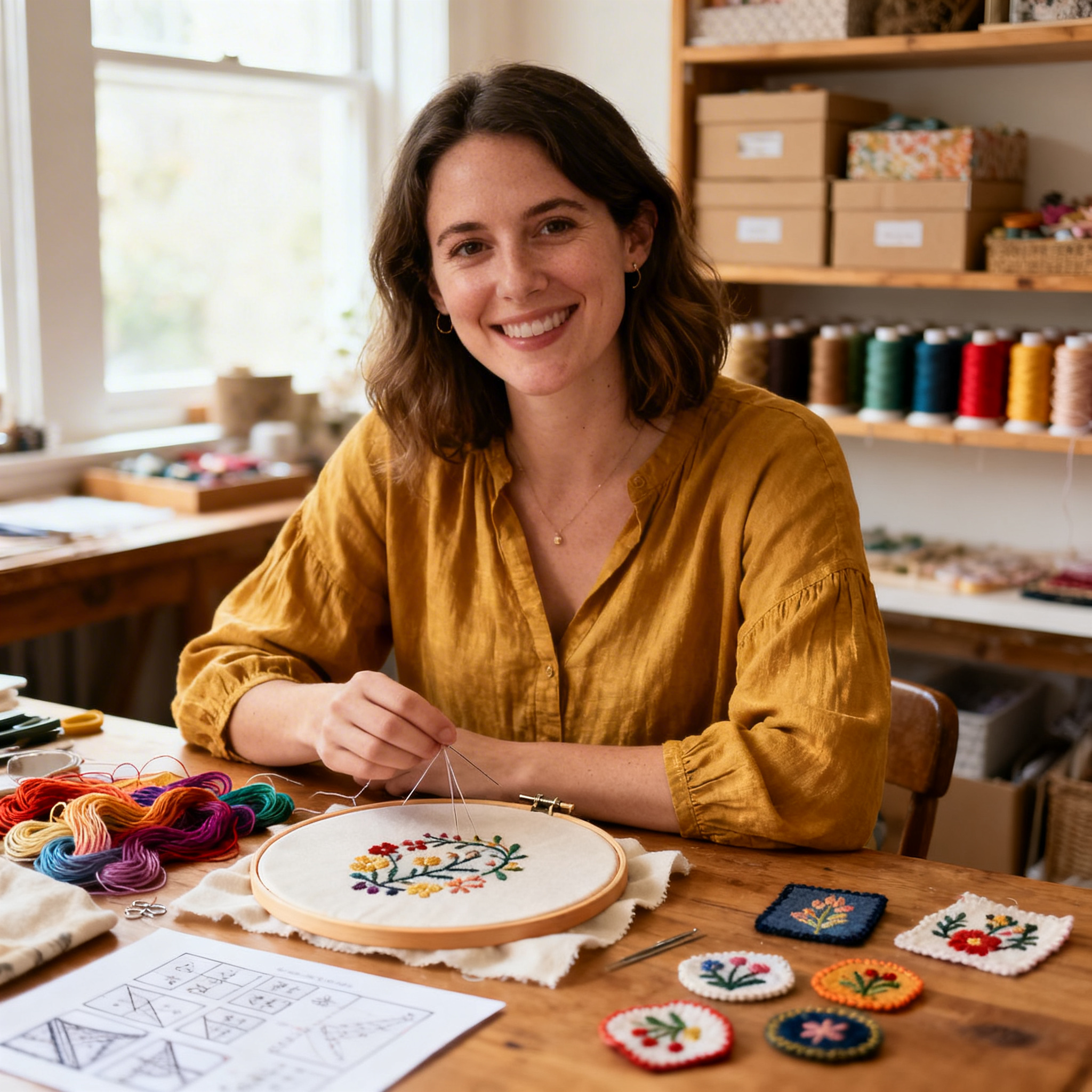
I’m Sophie Caldwell, the author behind granaboom.com, and I believe hand embroidery is one of the simplest, most relaxing ways to create something beautiful with your own hands. I started this blog to help beginners learn hand embroidery without feeling overwhelmed by complicated instructions or “perfect” results.
Here you’ll find beginner-friendly guides to decorative embroidery stitches, along with clear step-by-step practice ideas and patterns you can use to build confidence. My focus is on making the learning process easy: simple explanations, helpful stitch combinations, and small projects that look polished even when you’re just starting out.
Welcome to granaboom.com—grab your hoop, choose a few colors, and let’s stitch one line at a time.