How to Choose the Right Colors for Shaded Embroidery
Color theory for embroidery shading
Embroidery shading comes alive when you understand color theory. Pair threads thoughtfully to add depth, dimension, and realism. Think of color as the tool that makes stitches speak: hues set the mood, value pushes forward or recedes, and saturation controls boldness or softness. With these ideas, your designs gain life and tell a story with light and shade.
Build a small yet powerful color map in your head before stitching. You don’t need every color—just a few tones that work well together. The right pairings create seamless shading even with minimal changes in thread thickness, giving your work a noble, natural feel.
Shading isn’t about photo-perfect matches; it’s about capturing how light sits on fabric—highlights, midtones, and shadows. Keep that in mind and choose colors that blend smoothly as you stitch.
Hue, value, and saturation basics
Hue is the color family (red, blue, green). Value is how light or dark the hue appears. Saturation is how pure or muted it feels. Blend these three to create believable shading: lighter values for highlights, darker values for shadows, and subtle midtones keep transitions soft. Practice with a tiny color map: a base hue, lighter highlight, midtone, and deeper shadow. You don’t need many colors—small value shifts create depth. Test on scrap fabric first to save time and avoid overworking the final piece.
Aim for gentle transitions; small value changes matter more than big hue shifts. Your shading will read smoother and feel cohesive.
Use warm and cool colors for depth
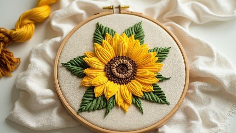
Warm colors (oranges, reds, yellows) advance; cool colors (blues, greens, purples) recede. Use this to place focus and create depth: warm highlights pop, cool shadows deepen the sense of form. You don’t need a large palette—small swaps can elevate the result. For faces, warm highlights near the cheekbone and cool shadows under the jawline read as round and lively. For petals, warm centers against cooler edges create a soft glow. Balance overall temperature to avoid a jarring look. Mixing warm and cool colors adds texture and guides the eye across the surface.
Simple color wheel tips
A tiny color wheel helps. Start with three adjacent hues for harmony and add one contrasting hue for a subtle pop. Use the lightest tint for highlights and the darkest shade for shadows. Keep transitions gradual to avoid harsh lines. Test on scrap fabric by creating a light-to-dark gradient within a single hue, label your threads, and note what reproduces well later.
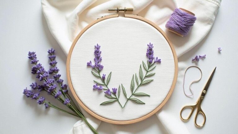
Choosing thread colors for shaded embroidery
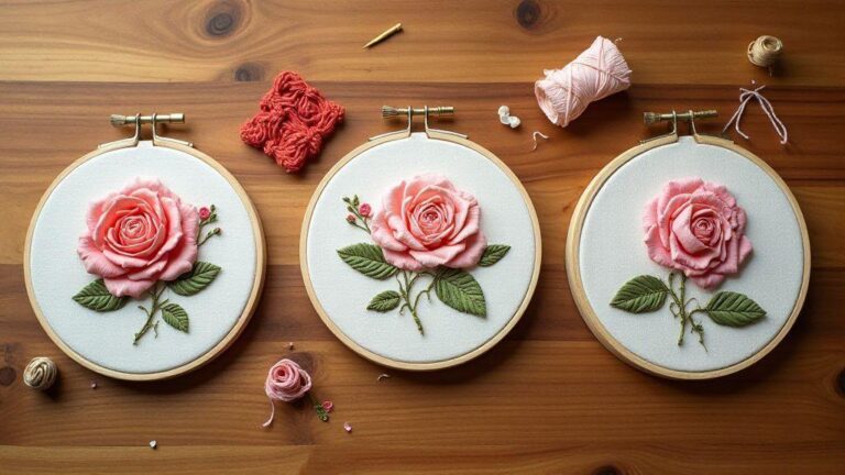
Shading with embroidery is about layering light, midtone, and dark threads to create depth. Plan your palette before you stitch: imagine a light source and map where highlights sit. Let the fabric color peek through where you want softness, while stitches blend into a natural gradient. Bold choices now look intentional, not accidental.
Think in layers: use a midtone as an anchor, then add lighter threads to lift surfaces and darker threads to deepen shadows. For curved shapes, keep midtones central and add lighter threads toward outer edges where light would hit. Maintain enough contrast between layers so shading reads without becoming blocky. A single thread can shift the mood—choose a couple of reliable shades and build from there.
Test colors on scrap fabric under your lighting. If the fabric steals brightness, switch to a slightly brighter midtone; if shadows vanish, deepen the darks a notch. This early check saves regret later and keeps shading smooth. The goal is dimensional embroidery without shouting color.
Start with a midtone then add lights and darks
Begin with a solid midtone as the base, then add lighter threads to raised areas and darker threads in recessed parts. Keep transitions soft and let the fabric’s natural color help the gradient read. Start small if you’re unsure.
Match thread to fabric color early
Harmonize thread and fabric by matching the midtone to the fabric color. Light threads will pop as highlights, darker ones tuck into shadows. If unsure, use a neutral shade a step lighter for lights and a step darker for shadows. Test on a scrap and check under different lighting. This approach keeps shading flexible as you sew.
Quick thread selection checklist
- Start with a midtone that anchors shading.
- Add lighter highlights and darker shadows.
- Check contrast in natural light.
- Match the midtone to the fabric for harmony.
- Test on scrap before committing to the main piece.
- Keep transitions soft and gradual.
Following these steps helps you control how thread colors interact with fabric, producing shading that reads as intentional and smooth.
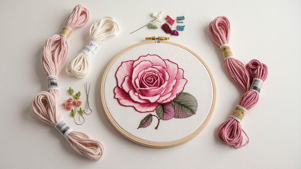
Blending thread colors techniques
Blending thread colors lifts embroidery from nice to wow. Plan color transitions as a story: pick a main color and a couple of close shades. Avoid harsh jumps—soft shifts read as natural. Practice on a small swatch to see how shades fade into one another, and keep tension steady for a smooth blend.
Choose colors with a common undertone (warm toward gold or peach when blending warm tones). Use a dark outline sparingly to anchor blends. Regularly compare stitches to the fabric in natural light to refine the gradient.
Gradually blend across shapes with a feathered approach: let one thread lead the center while lighter or darker threads feather in at the edges. If you need more control, switch to a smaller needle and longer stitches. Practice builds the ability to recreate subtle depth that makes flat designs pop.
Create gradient effects in shaded embroidery
Map colors along the design’s light source: start with a start color and end color in the same family, then insert 1–2 midtones. Layer thin passes to build a smooth transition, keeping stitches aligned for a clean gradient, especially on curves. Test on scrap fabric first. The fabric matters: light backgrounds reveal gradients more subtly; saturated fabrics make blends bolder. Vary stitch types to mimic natural shading, softening edges with nearby shades as needed.
Use two threads on one needle for subtle blends
Thread two colors at once with light tension to let the fabric show through. Apply the second color in small areas to create a gentle shift. Start with one color dominant; place the second color in spots to add depth. Use this on small areas first and adjust how the second thread is placed to avoid muddy lines. This technique produces refined, understated shading.
Fast blending tips
- Keep the palette small: 3–5 shades max per gradient.
- Test blends on scrap fabric.
- Maintain light, even tension.
- Stitch in the same direction for a clean transition.
- Base color should reflect the fabric’s natural lighting.
How to Choose the Right Colors for Shaded Embroidery
Choosing the right colors starts with the design’s light source and mood. Pick a base color that matches the main shading area, then add 1–2 midtones to soften edges. Limit to a cohesive family of hues, and if uncertain, select colors with the same undertone (warm or cool) for harmony. Compare colors under daylight to see which read as highlights or shadows. Over time you’ll develop a personal shorthand for quick color decisions.
How to Choose the Right Colors for Shaded Embroidery also means knowing when to stop. If a gradient becomes muddy or flat, revert to lighter midtones or the base color. Subtle blends trump flashy shifts, especially in decorative stitches where texture and depth matter. Practice with a few small projects to build a reusable guide.
Contrast and value in embroidery
Value gives depth to stitches. Use light and dark threads to make shapes read as real, not flat. Pair bold blacks with soft grays or creamy whites to push forward or pull back, creating a sense of depth and transition from foreground to background.
Value isn’t only about darkness; it’s how bright or muted a thread appears against the fabric. A pale stitch on a dark fabric can glow, while the same pale color on light fabric may vanish. Value is the language you speak with thread to show what sits near light and what remains in shade. Texture also affects value; smooth satin reflects differently than a textured fill. Balance smooth and textured areas to guide the viewer’s eye.
Use value to define form and light
Let darker areas recede and lighter areas come forward to sculpt your subject. Highlights on the top edge of a leaf or petal give sharp, touchable edges. A few careful highlights transform a flat image into a sculpted form.
Value also conveys texture. A stitched fur row or crinkled leaf reads differently as light hits each section. You don’t need a full palette—just the right values. Practice with simple shapes, then add light and shadow in deliberate steps. Choose stitches that catch the light appropriately: long satin for brightness, denser fills or dark threads in folds for depth. Your goal is guiding the eye with value, not an overload of colors.
Test contrast with small stitched swatches
Create tiny swatches to study value read on your fabric. Stitch a simple leaf or seam line with several value levels side by side. Compare from afar and up close to see which reads best. Label each swatch to repeat or adjust later. Test both light vs. dark and midtones vs. extremes. If a value isn’t giving depth, swap shades or adjust stitch density. Keep a notebook or digital record of what worked for future projects.
Value comparison method
Compare values with a simple scale. Place two stitches side by side and ask which is lighter, which is closer to white, and which reads as shadow. A 0–5 scale (0 = lightest, 5 = darkest) helps you map your palette objectively before applying it to the main piece. Remember to test on your fabric because base color can shift perceived value. When planning, this approach aligns with the concept of How to Choose the Right Colors for Shaded Embroidery to guide your palette and tests.
Matching thread to fabric color and palettes
Pair thread color with your fabric to let embroidery pop without fighting the background. Start with a base color that matches the dominant fabric shade, then layer harmonizing shades and a few contrast accents. Warm fabrics pair with golds, bronzes, and creams; cool fabrics with blues, purples, and cool grays. Bold stitches punctuate the design, while subtle threads keep it cohesive. The goal is balanced contrast, not loud competition.
Build a palette that fits the design’s mood. Delicate fabrics like chiffon benefit from softer blends; sturdy canvases tolerate saturated, high-contrast threads. Use a mix of light, mid, and dark shades so stitches read from a distance and glow up close. Test on a matching scrap to see how colors mingle in real light. The right palette makes the details breathe.
Build thread color palettes for embroidery
Choose a core color as your home base, then add one or two shading tones and a couple of contrast colors. Use the rule of three: base, support, and pop. Test on fabric swatches to see how light interacts with your threads. If something looks flat, shift toward warmer or cooler tones until the embroidery breathes. Save your favorite combinations for consistency across projects.
Adjust picks for fabric texture and sheen
Fabric texture changes color reads: satin reads crisper and brighter; linen can appear dusty. For rough textures, use bolder threads; slick fabrics allow finer threads to avoid snagging. Sheen matters: glossy fabrics pair with glossy threads; matte fabrics pair with matte threads for cohesion. If the weave is strong, consider two-thread or split stitches to prevent color pooling. Always test on a fabric scrap first.
Fabric-to-thread matching steps
1) Inspect fabric undertones (warm vs. cool) and choose complementary threads.
2) Pick a base color matching the dominant fabric shade; add 1–2 shading tones and 1 contrasting accent.
3) Test on a scrap with your chosen stitches.
4) Adjust for texture and sheen as needed, re-test.
Conclusion
Digital tools can speed planning and boost confidence, but your eye remains essential. Save color profiles for reuse and use digital suggestions as a starting point, then fine-tune by eye on fabric under lighting.
Digital tools for embroidery color matching
Digital tools don’t replace your eye—they sharpen it. Use a color library to compare hues quickly and build a palette before testing on scrap fabric. Treat tools as guides, not gospel, because fabric, lighting, and machine can bend colors in unexpected ways. Test palettes on fabric scraps to confirm how shades read at your stitching size. Digital tools help map light-to-dark ramps and anchor colors, but you’ll finalize shading by eye for a polished result.
Save successful palettes for future projects. The loop is: pick, compare, stitch, adjust, repeat. You’ll reduce muddiness in transitions and keep highlights bright where you want them.
Use apps to scan photos for shaded embroidery color selection
Scanning a photo provides a color snapshot for shading. Start with a simple image that shows clear light and shadow. Use the app to extract tones, then refine on fabric swatches since thread behavior differs in real life. Mark favorites, overlay them on the photo, and test how they blend. If you’re stitching a portrait, ensure midtones breathe and highlights sparkle without washing out.
If the photo isn’t perfect, adjust white balance, exposure, and saturation before exporting a palette. A quick scan speeds up workflow and helps shading stay cohesive across design elements.
Digital matching quick guide
- Start with three anchor colors (light, mid, dark) from your reference. Lock them in.
- Create 2–3 midtones between anchors to smooth transitions.
- Test on scrap fabric under display lighting.
- Adjust brightness and temperature in the app to better match the reference, then re-test.
- Save palettes as repeatable profiles for future projects.
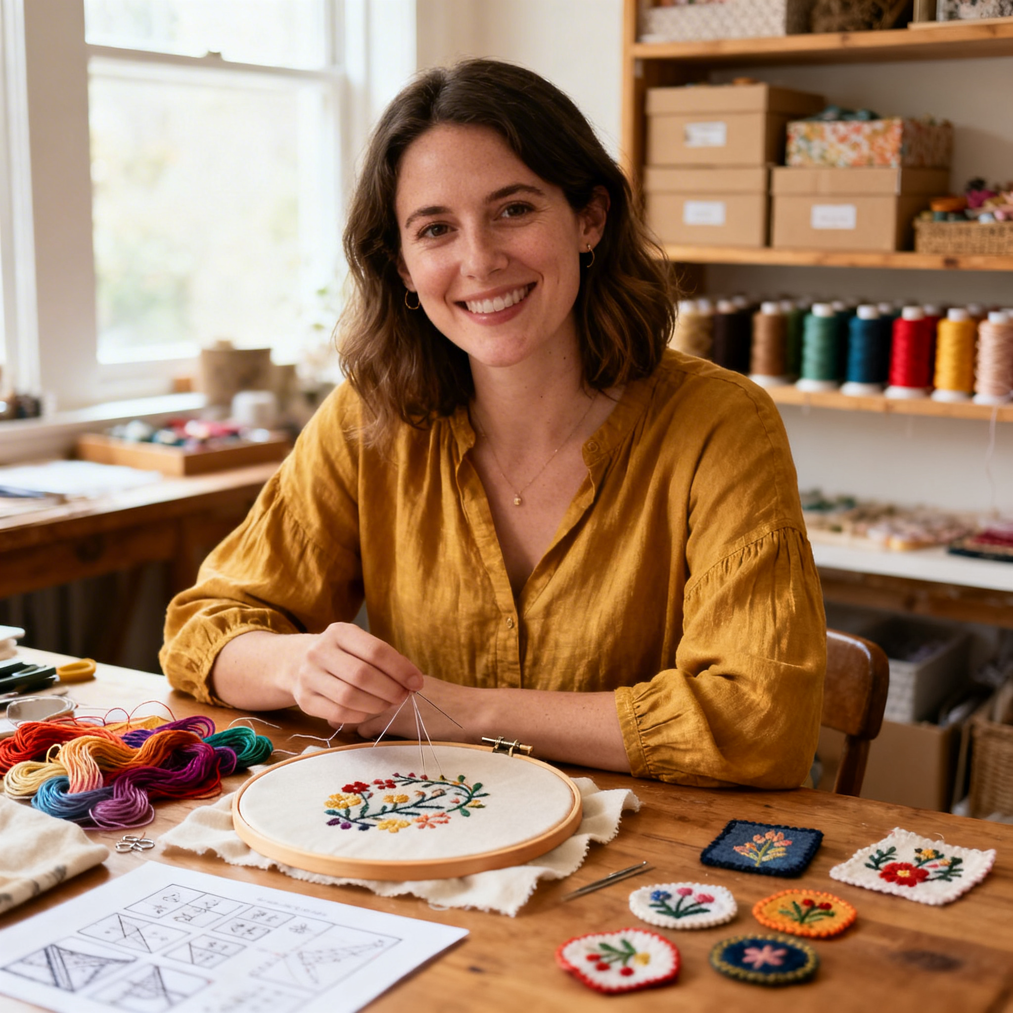
I’m Sophie Caldwell, the author behind granaboom.com, and I believe hand embroidery is one of the simplest, most relaxing ways to create something beautiful with your own hands. I started this blog to help beginners learn hand embroidery without feeling overwhelmed by complicated instructions or “perfect” results.
Here you’ll find beginner-friendly guides to decorative embroidery stitches, along with clear step-by-step practice ideas and patterns you can use to build confidence. My focus is on making the learning process easy: simple explanations, helpful stitch combinations, and small projects that look polished even when you’re just starting out.
Welcome to granaboom.com—grab your hoop, choose a few colors, and let’s stitch one line at a time.