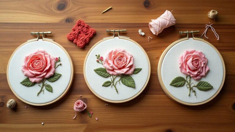
How to Blend Two Floss Colors for a Seamless Gradient Effect
Why you should blend floss
You’ll unlock richer color depth when you blend floss, not just flat blocks of color. By mixing shades, you create subtle transitions that make your embroidery look professional and polished. This technique helps your stitches glow, especially on fabrics with a natural weave where single colors can feel harsh. Practicing blending gives you control over tone and mood, turning a simple design into something you can be proud of.
Blending floss also gives you flexibility. If you don’t have the exact shade you want, you can mix two nearby colors to get the perfect match, reducing trips to the store and waste from unused skeins. The result is a smoother gradient that reads as intentional art rather than a patchwork of colors. Your project becomes more cohesive, and your stitches look deliberate.
Finally, blending floss boosts your confidence. As you see gentle color shifts improve texture and depth, you’ll reach for blending techniques more often. It’s a small skill with a big payoff, making bold designs feel accessible. You’ll notice your stitches sit nicer on the fabric, with fewer jarring color jumps.
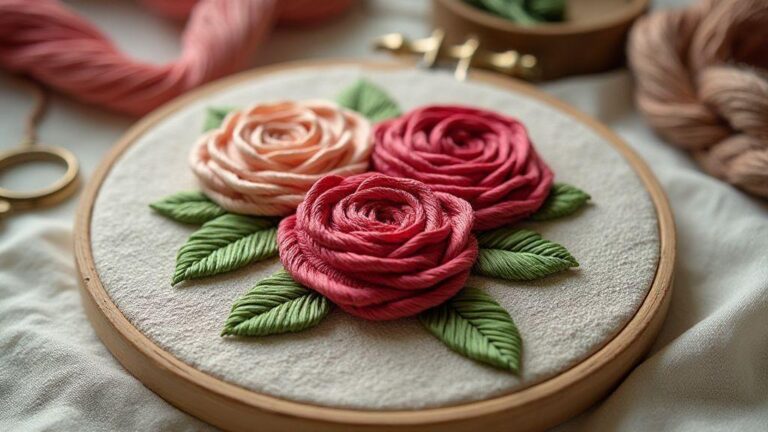
Seamless gradient floss technique benefits
A seamless gradient makes your design breathe. By transitioning colors gradually, you avoid harsh lines that break the illusion of shape. This smooth flow helps your embroidery look polished and professional, even if you’re still learning. The benefit is also emotional: the colors melt together like melted butter into toast.
Blending expands your palette without buying every shade. You can mix a warm and a cool color to create dozens of midtones, saving skeins while still delivering a high-end look. It can turn a simple outline into a living, breathing form.
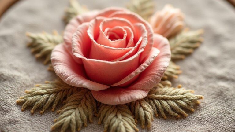
When to use ombré effect with embroidery floss
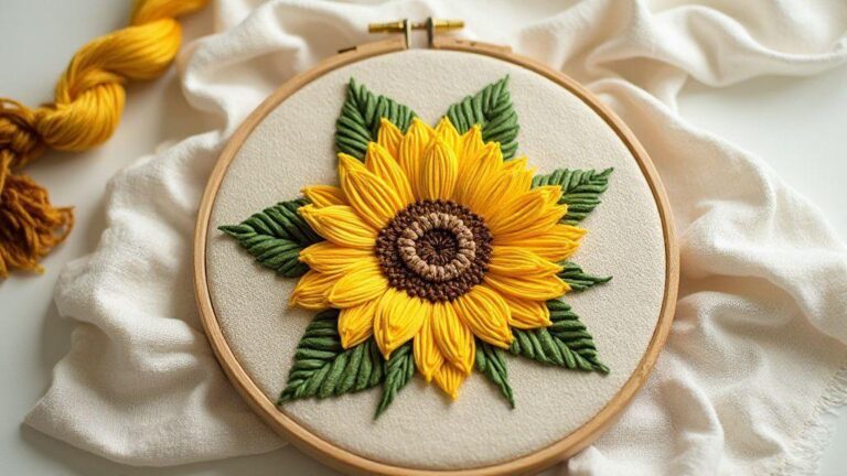
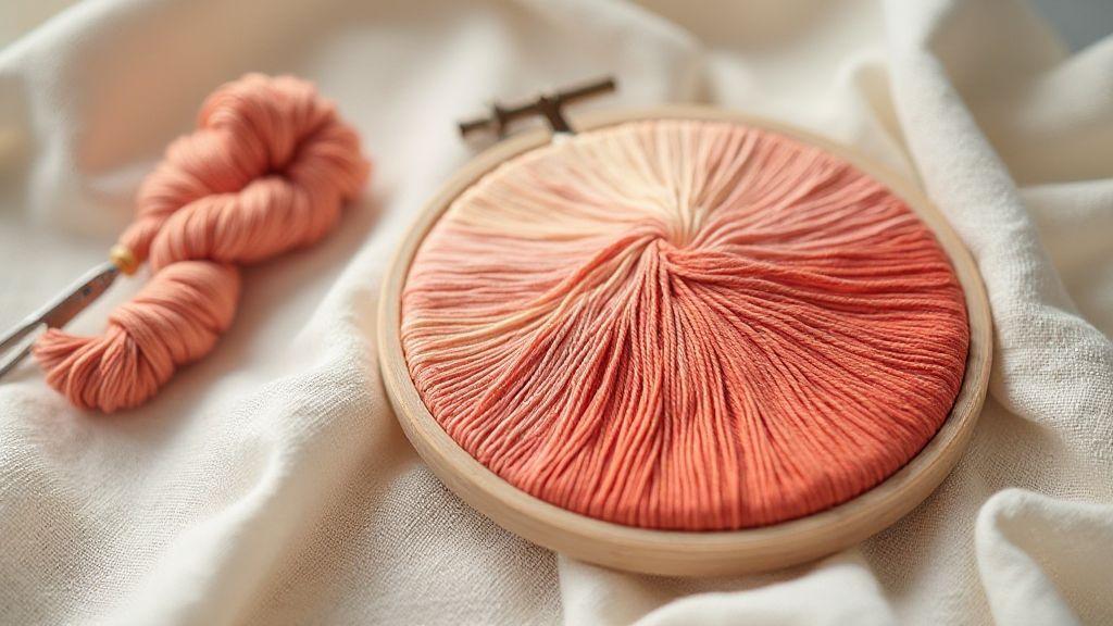
Use an ombré effect when you want a soft fade from light to dark or from one hue to another. It works well for petals, wings, or sunset backgrounds. If your fabric is busy, a gentle ombré helps the stitches stand out without getting lost. The transition guides the viewer’s eye across the piece, creating depth and a sense of layering.
How this boosts your stitches
The ombré approach makes each stitch feel intentional. Smooth color shifts reduce abrupt changes that can distract from the form, yielding a cleaner, more cohesive look. It also teaches patience, since smooth blending takes time and attention.
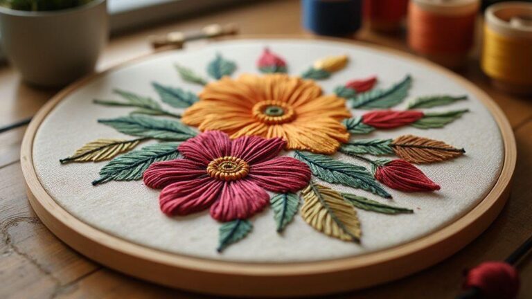
Pick colors you’ll love
You’ll feel more confident stitching when your colors spark joy. Start by choosing two or three shades that fit the project’s vibe. Pick a main color and a lighter or darker partner to balance it. Bold colors wake up a simple design; soft tones keep things calm and elegant. Your finished piece reflects your taste, so choose colors that feel right to you.
Think about how colors interact. Pair a bright shade with a muted one for more depth, or use near-neighbors on the color wheel for a subtle fade. For drama, try opposites. Test a few combos on paper or scrap fabric first. Your intuition is your best guide.
Consider the mood you want to create. Warm tones feel cozy; cool tones are calm. If you’re gifting the piece or choosing a room, align colors with that space or person’s tastes. The result will read as intentional design.
Mix shades for a smooth fade fade between floss colors
Choosing shades that blend well makes your gradient feel natural. Start with a lightest shade and a darkest shade, then add one or two mid-tones. This yields a smooth transition rather than big jumps. Use a palette with evenly spaced values to control and predict the fade.
Use the same brand and family of floss for a clean blend. Staying in the same line keeps thickness and sheen aligned. If you mix brands, you risk a visible mismatch in twist or texture. Keep your workspace neat and label threads to avoid mix-ups.
Test a gradient on a scrap: gradually swap mid-tones to refine the transition. A well-planned fade makes your final piece look professional and polished.
Match thread brand and strand count
Consistency starts with the basics: use the same brand across your project. Different brands can twist differently and sit at varied thicknesses, which breaks the fade. If you mix brands, you’ll see tiny tremors in the fabric.
Stick to a single strand count for your whole piece. Switching from 2 strands to 1 mid-project can create uneven petals or leaves and a gaping fade. Decide early and keep the choice steady. If you must switch for a deliberate effect, plan it ahead and test first so the change reads as intentional.
Test small swatches before you commit
Always test before you dive in. Use a scrap fabric to try your color plan, running a few stitches to evaluate the blend. If the fade feels abrupt or colors clash, adjust shades and re-test. This step saves rework on the main piece and builds confidence.
Keep test swatches organized by shade for easy comparison. Note how each color reads on your fabric, since the same floss can look different on light vs dark backgrounds. When the test looks right, carry that confidence into the main project.
Basic blending methods you can use
When you want your embroidery to look smooth and professional, blend two floss colors with simple, reliable methods. Start by considering your project’s mood: soft sunsets need gentle transitions, while bold pieces can handle sharper shifts. These techniques help stitches sit better, letting colors sing together rather than fighting each other. Practice on a small swatch, then transfer to your larger piece for a polished finish.
Choose floss weights and fibers with blending in mind. Cotton floss often yields the smoothest gradient with steady tension. On evenweave or linen, the grid helps you see where colors meet, ensuring a clean read. Keep tension even and stitches uniform for a seamless feel.
Plan your color map before you start. Map where the gradient begins and ends, and note where the next shade will appear. Forethought helps your top side shine and keeps underside from overthinking transitions. With these basics, you’re ready to apply the half-and-half, alternating stitches, and simple mixing rules covered next. Your goal is a cohesive piece where every stitch belongs.
How to Blend Two Floss Colors for a Seamless Gradient Effect: step-by-step advice
How to Blend Two Floss Colors for a Seamless Gradient Effect is a foundational skill for professional-looking embroidery. Start with two colors and a simple plan: light to dark, or two adjacent hues. Test on a scrap, map a color ladder, and keep tension even. This approach helps you create a natural transition that feels deliberate rather than accidental.
- Set up a color ladder on a scrap: lightest near the start, darkest near the end.
- Hold strands loosely and twist gently to prevent fraying.
- Use an overlap in the transition zone to soften the shift.
- Test different methods (single-pass blends, double-pass blends, and lazy blending) on scrap fabric to find what feels smooth to your eye.
- Keep brand consistency and strand count throughout for a uniform fade.
These steps illustrate exactly How to Blend Two Floss Colors for a Seamless Gradient Effect in practice, giving you a reliable path from concept to finished piece.
Half-and-half strand mix for two color floss transition tips
You’ll love the half-and-half method because it’s easy and yields a smooth blend. Align two color lengths side by side, then combine strands so half carry one shade and half carry the other. Keep stitches consistent in size and lay to maintain an even transition. Place the blended thread at the start of the line, allowing the second color to flow in on the next stitch. Slow down on curves to maintain even coverage.
Alternating stitches for cross stitch color blending method
Alternating stitches create a soft, continuous gradient. Alternate between colors every stitch, or every few stitches, keeping tension even. Start with a few stitches of color A, then swap to color B in the same row, letting colors meet where the needle passes. Vary patterns to adjust the gradient’s sharpness and account for fabric weave.
Simple rules for even strand mixing
Keep strand lengths consistent and test blends on scrap first. Use equal amounts of each color in your method, whether halving strands or alternating stitches. If the fabric shows thread twist, flip the piece to inspect the back. Clear, deliberate tension helps every stitch blend stay put, ensuring your gradient reads as intentional.
Blending floss colors step by step
You’re about to turn simple stitches into a smooth, professional gradient. Start with two colors and a base fabric that won’t grab threads. Test a small swatch first, then stitch with even tension and attention to color placement.
- Map light to dark and test the transition on scrap.
- Create a color ladder to visualize the path.
- Practice with different blending methods to find what reads smoothly.
Your end result should feel like one continuous flow of color, not a stack of blocks.
Prep threads with an embroidery floss blending tutorial
Before the real piece, gather floss and separate strands to match your planned blend. Tie off ends to prevent fraying and visualize how two colors will meet. Practice pilot stitches on scrap, noting how stitch direction affects the gradient. If a transition looks harsh, adjust by adding lighter color at the transition and re-test.
Experiment with blending methods on scrap: single-pass, double-pass, and lazy blending. Choose the method that yields the smoothest fade for your project.
Overlap colors and shorten steps to fade between floss colors
Overlap is your friend when you want a seamless fade. Let the lighter color meet the darker one by sharing stitches at the transition. Shorten steps slightly in the transition zone to keep the fade tight. Maintain consistent needle entries and exits to prevent gaps. If you see a visible step, add tiny stitches of the lighter color into the darker area, then reverse with the darker color.
A clear three-step stitching plan
1) Pick your light and dark colors and lay them out in order. 2) Create an overlap at the seam where the colors meet, shortening steps to fade between hues. 3) Test on scrap, adjust tension, and apply the blended technique to your main project.
Fix rough transitions you see
Rough transitions appear when colors or stitches switch abruptly. Plan your thread path, start with a small backstitch at the color meeting point, and float the next color slightly above the previous stitch to soften the seam. Keep tension even to avoid bunching. If you see a jumpy gap, add a couple of tiny stitches to bridge it. Use a gradient approach to melt colors together rather than collide.
If you notice harsh lines, rework the edge with gentle satin or long-and-short stitches to blur the boundary. A light touch is key—avoid pressing too hard, which can flatten the stitch. Loose up and focus on smooth thread arcs to end transitions gracefully.
Use extra overlap and backstitch for a smooth color transition thread
When switching colors, add extra overlap where colors meet. Backstitch along the seam to anchor threads without pulling the fabric, creating a gentle transition rather than a chunky seam. The overlap acts as a safety net, guiding the eye along the gradient path and keeping sections cohesive.
Correct banding and dark lines in ombre effect with embroidery floss
Banding happens when floss fibers split or stitch length changes. Keep stitch length consistent and use properly separated floss. Test on scrap, and if needed, choose longer stitches that sit deeper in the weave to hide lines. If dark lines appear from over-tension, loosen slightly and finish small areas with backstitch or satin stitch to smooth the surface. Position lighter tones toward the top and darker toward the bottom to guide the eye.
If a strong edge remains, add a hairline blend stitch that’s nearly invisible to soften the boundary. With patience, your ombre reads soft and professional.
Quick tweaks to improve your blend
Do quick tests on scraps with varied stitch lengths and densities to see what your eye prefers. Adjust thread direction by angling stitches slightly to smooth stubborn seams. Practice with a clear goal: a small gradient swatch helps you refine techniques before applying them to a larger project. Document what works and reuse it.
Try advanced decorative stitches
Elevate embroidery by exploring stitches beyond the basics. Start with backstitch variations, then layer satin stitches and whipped running stitches to create subtle shadows. Map a small swatch book to compare outcomes and see which stitches pair best with your fabric and threads. Try a bold color in one area to judge readability at distance, then switch to a complementary shade for depth. Combine stitches in a motif for balance: denser fills with smoother outlines keep the piece cohesive.
Mix variegated and solid shades when mixing embroidery threads for gradient
Mix variegated and solid threads for organic gradients. Place variegated next to solid shades that match one hue in its range and test on a small section. Adjust strand counts to control the blend. If you want a softer gradient, use more solids with a touch of variegated thread; for a bolder shift, let the variegated thread lead.
Consider gradient start and end points carefully and observe how variegation moves across stitches. If a segment looks off, switch the variegated thread’s position or add a contrasting solid to anchor it. Variegated threads can pool or streak if pulled too tight, so adjust tension and stitch density accordingly.
Apply the seamless gradient floss technique to motifs and lettering
The seamless gradient floss technique helps motifs and lettering glow with natural transitions. Choose a color family and plan light-to-dark steps with a short change range. Maintain consistent stitch length to keep the gradient read as a natural fade.
When applying to lettering, keep readability: start with the lightest shade at the top and deepen toward the body of the letter. For motifs, place lighter tones at edges where light lands and deepen in recesses. Layer a thin solid outline to keep shapes crisp against the gradient.
Practice on a test piece, then transfer the best gradient to the final project. If a section looks busy, reduce gradient steps or widen color-change gaps. The trick is a subtle balance that remains readable yet richly crafted.
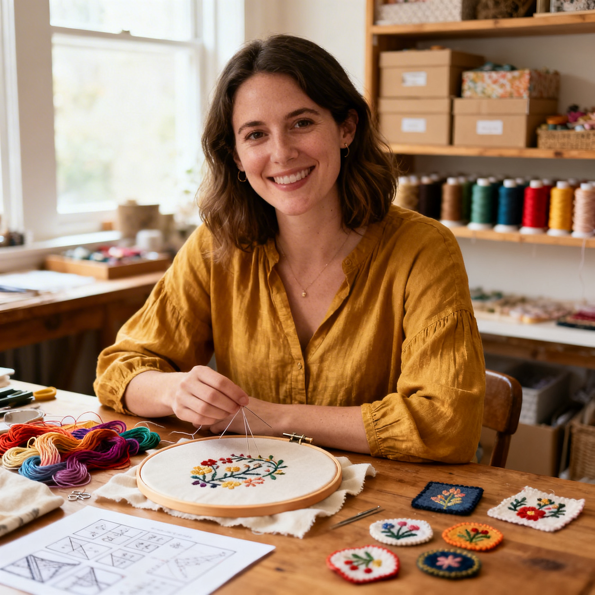
I’m Sophie Caldwell, the author behind granaboom.com, and I believe hand embroidery is one of the simplest, most relaxing ways to create something beautiful with your own hands. I started this blog to help beginners learn hand embroidery without feeling overwhelmed by complicated instructions or “perfect” results.
Here you’ll find beginner-friendly guides to decorative embroidery stitches, along with clear step-by-step practice ideas and patterns you can use to build confidence. My focus is on making the learning process easy: simple explanations, helpful stitch combinations, and small projects that look polished even when you’re just starting out.
Welcome to granaboom.com—grab your hoop, choose a few colors, and let’s stitch one line at a time.