Designing Embroidery Lettering from Scratch
Core principles of embroidery lettering design
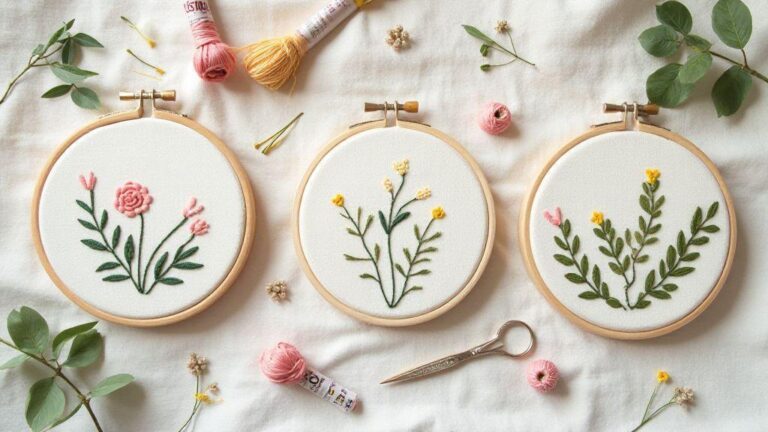
Embroidery lettering is more than writing on fabric—it’s a deliberate visual choice. You balance line weight, spacing, and stitch type to create a message that sits well on the material. Aim for clarity, rhythm, and a hint of personality. Decide the mood first: bold block letters for a gym bag, delicate script for a handkerchief, or playful sans for a kids’ shirt. When the design stays simple and intentional, the stitches speak for you.
Consider the fabric and how it behaves. A tight weave shows more detail; a loose weave reveals gaps. Choose thread colors that pop against your base fabric, not just what you love. Plan stitch density ahead: too dense and the fabric puckers; too sparse and letters look washed out. Test swatches save you from guessing on the final piece.
Tools matter. A stabilizer underneath prevents wobble, especially on knits or delicate fabrics. A hoop keeps tension steady so letters stay straight. Start with the letter style, then pick stitches to support it—satins for bold outlines, fills for solid blocks, and a few backstitches to sharpen corners. Keep the design modular so you can tweak spacing or size without rewriting the whole piece.
Start designing lettering from scratch
Begin with a simple sketch of your word or phrase. Feel how each letter breathes, then draw a few variants and compare how they sit on a baseline. When you translate to stitches, choose a primary letter style and apply it consistently across all characters for a rhythm, not a jumble.
Think about the baseline, x-height, and cap height—these guide how letters sit and how tall they appear. If unsure, start with a blocky, even stroke for every letter; it’s readable and easy to adjust on busy fabrics. Once you’re happy with the outline, plan stitch types per letter: satin for solid areas, a running stitch for light outlines, and a small backstitch to define edges. Fine-tune spacing to avoid crowding; your eyes will thank you when the words breathe.
Try printing the design at real size and placing it on a sample fabric to catch scale issues before stitching. If a letter feels off, redraw and re-test. Your aim is a clean, legible line that reads from a short distance, not a map of tiny details up close. The payoff is confidence you’re Designing Embroidery Lettering from Scratch with intent.
Fabric and thread effects on stitch density control
Fabric texture guides stitch density. A smooth cotton reads with less density; textured linen benefits from slightly more fill to cover the surface. Adjust density in small steps and test on a swatch. If the stitch looks sparse or gaps appear, add density or switch to a stitch that provides more coverage.
Thread choice shifts the feel of your letters. A high-sheen rayon glows on dark backgrounds; cotton floss offers a matte, friendly vibe. Balance shine and visibility by matching thread weight to your fabric’s texture. For intricate details, use a finer thread with shorter stitches to avoid bulky piles that blur lines. Density isn’t just about coverage; it shapes legibility and edge sharpness. Heavy density on curves can cause puckering, so lighten fills near tight corners and use a small satin stitch to clean up. Test how each letter reads from a few feet away, then tweak. The goal is uniform edges, steady density, and legible letters on the move.
Legibility rules for small letters
Small letters must stay readable at a distance. Use a sturdy, straightforward font and avoid overly decorative swirls for tight spaces. Maintain consistent stroke width, baselines, and letter spacing so the word reads as a single unit.
When letters shrink, emphasize open counters (the holes inside letters like o and e) and avoid fine details. Use slightly bolder outlines and ensure enough space between characters so they don’t merge. If a letter becomes unclear, simplify it or increase its size slightly. Stitch a mini version on the same fabric to test from arm’s length.
Monitor progress as you go. If a letter is getting lost, pause to rework the outline or switch to a stronger stitch. Small letters demand patience, but with careful spacing and solid edges, your message stays clear.
Embroidery digitizing workflow and tools
Embroidery digitizing blends art and science. Start with an idea, translate it into stitches, and test before you sew. A clear workflow helps projects become faster and more consistent: plan the design, choose the right tools, digitize carefully, and test before final stitching. The right routine makes Designing Embroidery Lettering from Scratch feel natural, not guesswork.
Choose tools that fit your style. A comfortable tablet or graphics pad helps you trace curves smoothly. A dependable hoop and stabilizers keep work flat and neat. Software should match your goals—some excel at lettering, others with complex fills. Ensure your export formats are compatible with your machine, and keep notes on settings that work well so you don’t reinvent the wheel.
Choosing digitizing software and hardware
Your software should feel natural in your hand. Look for an interface that’s easy to learn and fast to navigate. If you’re new, choose programs with guided fonts, simple shapes, and built-in help. For seasoned users, emphasize advanced path editing, stitch control, and real-time preview. Hardware matters too: a responsive tablet, a pressure-sensitive pen, and a reliable computer keep your flow steady. Quick zoom, pan, and tweak capabilities save time.
Security and compatibility matter as much as speed. Export cleanly to common formats your machine understands. If you collaborate, choose software that lets you share projects without losing settings. A good setup feels like your own organized workspace: fast, predictable, and efficient. Invest in tools that match your style to maintain momentum and deliver projects you’re proud of.
Steps for font digitizing for embroidery
Start with a clean sketch of the letters. Trace each letter with bold, even lines to give stitches a solid backbone. Choose stitch types for each part: satin for outlines, fill for thick areas, and backstitch for clean joins. Keep even letter spacing and test a few sizes to see how they sew on fabric. Learn where curves tighten and where to add support under tricky stems.
Fine-tuning is key. Adjust stitch density, underlay, and pull compensation to avoid gaps or puckering. Use a small test hoop and scrap fabric to preview the look before finalizing. Save incremental versions as you go so you can backtrack if needed. Practice makes perfection, and soon you’ll feel confident Designing Embroidery Lettering from Scratch.
Export formats and hoop size checks
Always verify hoop size before exporting. Your final file should match your machine’s hoop and the fabric you’ll use. Export at the correct density with clean, stitch-friendly paths. Save multiple formats if you work with different machines, and label files clearly to avoid mixing fonts or layouts. Quick checks save you from redoing a project later.
Run a short test on a scrap piece and adjust if you see misalignment or puckering. A simple hoop and stabilizer test can catch most issues early. Tracking hoop sizes and export settings helps you stay consistent across projects and clients.
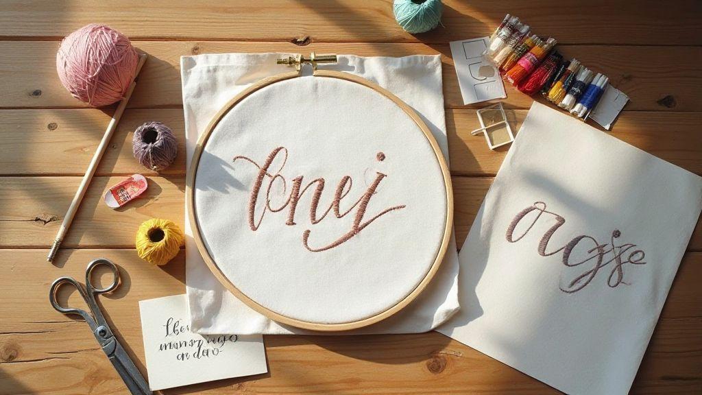
Satin stitch lettering and fill methods
Satin stitch lettering gives clean, glossy edges that pop. Start with a simple, readable font and plan your satin fill to be even and smooth. Consider how tight the fill will be and where you’ll place underlay to keep the surface flat. A well-executed satin fill looks glossy from a short distance and holds up after washing. If the fabric stretches, test a small sample first to see how stitches behave. Your goal is readable, professional lettering that lasts.
Map out main satin lines for each letter first, then fill gaps with evenly spaced stitches. Spacing and stitch length matter: too close equals stiffness; too far loses coverage. Maintain consistent stitch direction within a letter to avoid a hatched, wavy look. If lettering sits on a curve, guide the fabric gently and keep stitches parallel to the curve for a smooth silhouette. Test densities to find balance: medium density often suits cotton and blends, tougher fabrics handle tighter fills. If fabric shows through satin stitches, add a light underlay or tweak density. Finish with a quick press from the back to set the stitches. You’re Designing Embroidery Lettering from Scratch—trust your eye and adjust as you go.
Satin stitch lettering placement tips
Place lettering with a clear baseline and consistent height for a professional look. Align letters along a straight line, even if the design curves slightly. When spacing, measure gaps between letter centers to keep things balanced, especially on small surfaces.
Consider fabric and hoop: a tight hoop and flat fabric reduce shifting, helping satin stitches stay uniform. For curved words, add a gentle arc to the baseline to prevent tilt. If near seams or edges, allow extra margin to avoid crowding the seam line. Test on similar fabric and adjust placement until it lands where you expect. Start stitching from the center letters outward to maintain balance, and fix any off letters early to save headaches later. The aim is clean, confident placement that reads well at a short distance and up close.
Underlay stitching for letter types
An underlay helps satin fills sit neat and vertical for both serif and sans-serif letters. Begin with a light zigzag or running underlay along the outer edge of letters to unify the surface and reduce puckering on knits or loose weaves. If fabric is stiff, you can skip heavy underlay but don’t skip the light stabilizing stitches.
Tailor underlay to letter shapes: tall, narrow letters keep underlay close to the inner outline for crisp edges; wider, rounded letters use a looser underlay that anchors the fill without distorting curves. Test patterns on scraps to see which keeps satin lines straight and aligned. Choose thread weights and stitch lengths to match the underlay—dense underlay can look bulky; too sparse, you lose edge control. A balanced underlay sharpens letters and enhances durability.
Stitch path optimization and kerning for embroidery
Stitch path optimization makes embroidery look clean and professional by reducing thread breaks and run times. Plan smooth routes that avoid unnecessary jumps and overlaps, keeping lines tight where needed and allowing a breathable flow in larger areas. This is especially important for lettering and bold shapes.
Kerning matters because spacing affects readability and overall look. When done well, letters breathe; when off, lines crowded or gaps appear. Adjust kerning to match fabric texture and font curves, preventing overlaps that ruin legibility. Save presets for different fabrics and threads to speed future projects.
Combine path optimization with thoughtful kerning for a smoother workflow and sharper results. Map where to start, how to move, and how to space letters so the final piece feels intentional and polished.
Kerning for embroidery to avoid overlaps
Start with a clean baseline and a trusted font, then test a small sample to check how characters sit on fabric. If two letters touch oddly, nudge spacing slightly. If gaps distract, bring letters closer. Balance readability with a compact look, avoiding overlaps that pull threads in awkward directions, especially on curves. Test on the same fabric and thread type you’ll use final, adjusting in small steps. For multi-line lettering, maintain a consistent rhythm between words so the block feels unified. Save different kerning presets for different fabrics and thread types to speed future projects.
Reduce trims with stitch path optimization
Plan stitch paths to minimize jump stitches and trims by grouping connected shapes and using run stitches where possible. Continuous paths reduce clipping and re-threading, speeding production and reducing visible ends on the front. For lettering, stitch in one smooth flow rather than jumping between separated components.
Think through stitch order: outlines or fills first, then inner details, then outer edges. This sequencing minimizes direction changes and reduces starts and stops. If trims are necessary, do them after larger sections to stay efficient. Use the right foot and stitch type for each segment; plan paths to avoid trimming at tight corners. The goal is a smoother piece that reads well and saves time.
Plan stitch sequence before you sew
Map the entire stitch sequence before you sew. Start with a rough path, then refine it to connect shapes logically. A well-planned sequence prevents missed areas and uneven density, which can cause puckering. Plan density zones and underlay early to ensure fills and outlines sit correctly relative to neighbors. Always test the sequence on scrap fabric first to catch density, hoop, or thread tension issues before the final run. Once you lock in a sequence, your future projects will feel consistently solid.
Applique lettering methods and monogram digitizing techniques
Applique lettering blends design with stitch work, using a fabric base and a letter overlay. Start with bold, simple letterforms that read well at small sizes. Use a satin stitch for the outline and a dense fill for the interior. When cutting applique pieces, choose stable, low-bleed fabrics to prevent warping. Place alignment marks and keep spacing even for a deliberate look. Designing Embroidery Lettering from Scratch begins with selecting the right bases and stitch types to set your project up for success.
Then, focus on how layers come together. The base fabric stays flat; lock the applique edge with a wide zigzag or satin edge, then baste the applique in place before final stitching. The monogram’s letters should be bold enough to read from a short distance, so use larger stitch counts and stronger scale. If using multiple colors, keep a simple palette with one dominant color and contrasting accents. Test on scrap fabric to ensure density won’t overwhelm the piece.
Choose a fabric that holds stitches well and isn’t prone to fraying. A heat-adhesive stabilizer on the back can prevent shifting, with excess removed after stitching. Double-check needle size and thread type: heavier thread and a sharp needle yield crisper edges; lighter thread gives a softer, vintage feel. Trim loose threads and press from the back to protect stitches. Test colorfastness and stabilizer residue on similar fabrics to ensure a bold, readable applique.
Applique lettering methods for bold text
Bold applique uses large, sturdy letterforms and a wide satin border to secure the edge, with a dense fill inside for a strong block of color. Digitize by filling first, then adding satin outlines around each letter, keeping a consistent edge distance. Add a center stabilizer under each letter to prevent stretching. If color balance is unsure, pick one dominant color and keep others as accents. Test on scrap fabric to ensure the density won’t overwhelm the garment.
Choose a medium-weight fabric that holds stitches and resists fraying. A heat-adhesive stabilizer on the back helps prevent shifting, with excess removed after stitching. Check needle size and thread type to achieve crisp edges or a softer vintage feel. Trim loose threads and press from the back to finish, testing colorfastness as needed. Bold applique should read clearly with clean lines that pop from the background.
Monogram digitizing techniques for initials
Monogram initials shine when letterforms stay simple and spacing is even. Scale each initial slightly larger than body text to create a balanced silhouette, then outline with satin and fill with a dense interior. Add light stabilizer to prevent puckering on garments. Align initials with even spacing to form a cohesive block, adjusting vertical and horizontal spacing for three-letter combinations. A subtle flourish can be added, but keep it minimal. Save different versions for different projects—tighter spacing for small garments, broader spacing for larger banners. The goal is readable, stylish monograms across fabrics and sizes.
Patterns, templates, and hands-on project tests
Ready-made patterns and templates save time, while hands-on projects reveal real-world behavior. Start with a few simple letter styles and organize everything in a folder: patterns, templates, and tests. Templates speed Embroidery Lettering from Scratch by letting you trace shapes onto fabric and align with hoop marks, keeping spacing consistent. Hands-on tests confirm templates and patterns work in real life—check stitch density, underlay, and pull compensation on fabric similar to the final product. Treat each test as a learning step.
Use templates to speed embroidery lettering design
Templates provide a fast, repeatable starting point. When designing a new piece, drop in your chosen font into the template, adjust size, and align with hoop marks. This reduces redrawing and keeps spacing uniform, delivering a smoother workflow and fewer alignment glitches. If a template doesn’t fit perfectly, tweak it once and save the new version for future projects.
Test hooped samples in your embroidery digitizing workflow
Hooped samples reveal real-world behavior. After digitizing, hoop the fabric, run a short test, and inspect stitches. Look for uneven density or edge pull. If something looks off, refine pull compensation, stitch direction, or underlay before a full run. Treat each test as a learning step to protect your final piece and keep your workflow trustworthy.
Fix common problems after sample runs
If issues appear after a sample, tackle them quickly. Common fixes include adjusting density, tweaking underlay, and rechecking alignment. If letters look fuzzy, increase satin density or adjust stitch length. If fabric puckers, soften pull compensation and improve hoop stability. After applying fixes, run another small test to confirm the improvement. You’ll feel more in control and your lettering will look cleaner.
Designing Embroidery Lettering from Scratch: quick reference and practice
- Use a simple, legible baseline for all letters and keep spacing consistent to support readability from a distance.
- Test density and underlay early on sample fabrics to prevent puckering and edge softness problems.
- Apply careful kerning to avoid overlaps, especially on curved surfaces and dense fabrics.
- Plan stitch paths and sequence before sewing to minimize trims and ensure clean edges.
- Build a modular design that can be tweaked easily without redoing the entire piece.
- Always test on scrap fabric and save incremental versions to enable easy backtracking.
Designing Embroidery Lettering from Scratch is a repeatable craft when you follow a thoughtful workflow, test thoroughly, and adjust as you go.

I’m Sophie Caldwell, the author behind granaboom.com, and I believe hand embroidery is one of the simplest, most relaxing ways to create something beautiful with your own hands. I started this blog to help beginners learn hand embroidery without feeling overwhelmed by complicated instructions or “perfect” results.
Here you’ll find beginner-friendly guides to decorative embroidery stitches, along with clear step-by-step practice ideas and patterns you can use to build confidence. My focus is on making the learning process easy: simple explanations, helpful stitch combinations, and small projects that look polished even when you’re just starting out.
Welcome to granaboom.com—grab your hoop, choose a few colors, and let’s stitch one line at a time.